From time to time, I'm hired to design a mascot for a sports team. These tend to be some of my favorite projects, but also some of the more challenging projects as well. I tend to look at a mascot design like an icon for a logo. There are many similarities between the two. First the image should be clear and easy for the viewer to make out. I prefer to use simple shapes to make a somewhat more complicated image, but not too complicated. I want it to be stylized, not ultra-realistic. I also want something that is easily produced on apparel, signs, print and more. The goal is to make the design look like it was easy to create, even if it wasn't.

Step one is to go over the things you know need to be a part of the design. I knew the name, I had a basic color theme and I knew that the design was for a baseball team.
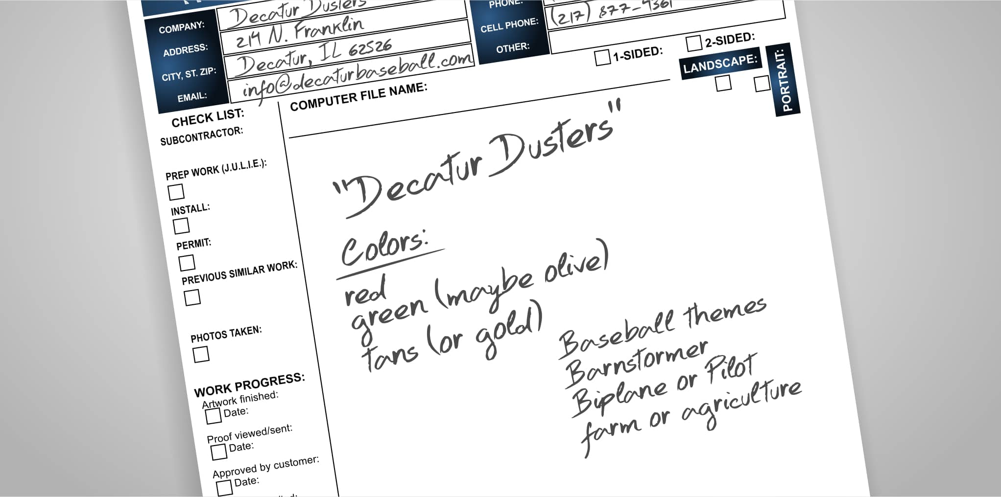
Step two is to brainstorm and gather reference images. Reference images don't just have to be images of what you plan on drawing and in some cases you may not know exactly what you are drawing until you have options. While browsing the internet you may come across a logo with a color theme you really like, or perhaps you like the lettering style or font used on a different design. I spend a good deal of time getting inspired but taking care to not let the images I find influence my design too much. The goal is to make something unique. I create a new file in CorelDRAW and name it. Then I browse the internet looking for inspiration. If I find something I like, I copy then paste it in that new CorelDRAW file. You can also utilize CONNECT to browse content. To do this I recommend, in CorelDRAW, going to Windows > Dockers > Connect. Once the docker is visible at the top of the docker you can search for images. I really like searching for reference photos on iStock. If you plan on using the image you find in a design, you must purchase the image so you can legally use it.

The next step depends on what you are most comfortable using. You could start sketching things out in CorelDRAW, maybe use a graphics tablet, or in my case I like to use an old fashioned pencil and pad of paper. I have a small notepad that I doodle in, but sometimes I might make small sketches on post-it notes. I like to make my sketches small because I feel like those small thumbnail drawings lend themselves well to simple and clean layouts. The larger my sketches are, the more detail I tend to create and for projects like this you don't always need a bunch of detail. My sketches aren't pretty. They are just supposed to get me in the ball park (no pun intended). You just want to get a basic look and feel to work from. Don't get discouraged if your sketches aren't exactly what you had in mind. You will be able to fine-tune the design as you go. I created several little thumbnail sketches. And pick one, sometimes two, to build from.
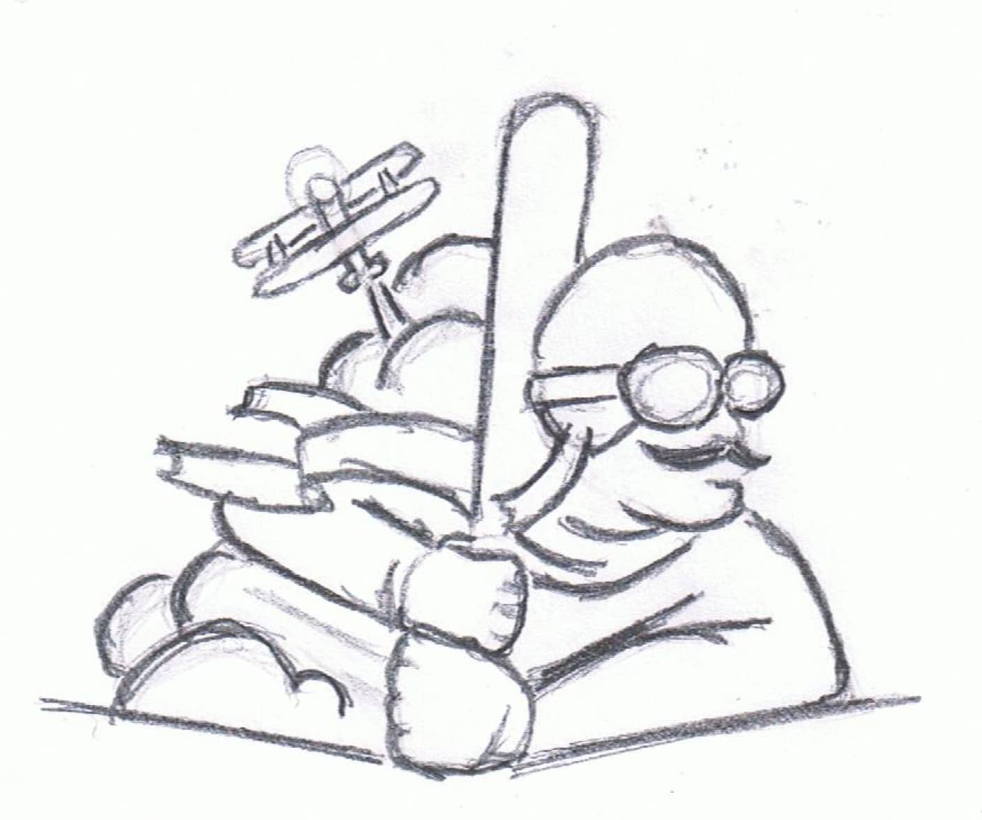
Using my scanner I scan the paper with the sketch. Go to: File > Acquire Image > Acquire. Follow your normal scanning process. It will be different for each person depending on your scanner. Once you are done, hit OK and place the scanned image on your workspace.
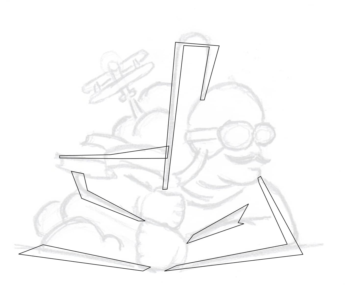
Now that I have a basic sketch to work from I then rough out some basic shapes over top of the sketch. Before I do that, I select the sketch and using the Transparency Tool (Toolbox > Transparency Tool), I apply a Uniform Transparency of about 80% from the Properties Bar. Next, using the Pick Tool (Toolbox > Pick Tool), I right-click on the transparent image and select Lock Object. By locking the image, I can easily work over the top of my sketch without accidently selecting it.
Now I can start creating vector shapes over the sketch. I start by selecting the Freehand Tool (Toolbox > Freehand Tool or keyboard shortcut F5). The Freehand Tool works in a few different ways. If you click and hold down the mouse button, the line will follow the path of your mouse curser and you can create curved lines. However, if you click once and let go and move your mouse cursor to another point on your workspace then click a second time, you will create a straight line. The goal is to create “closed” shapes, so start the next line by clicking on the end point of the line you just created. Finally, the last line of the shape should end by clicking on the very first point you started with. You know the shape is closed when you can apply fill or color to the shape.
At first I don’t worry about curved lines. I just want straight lines. I’ll add the curves next.
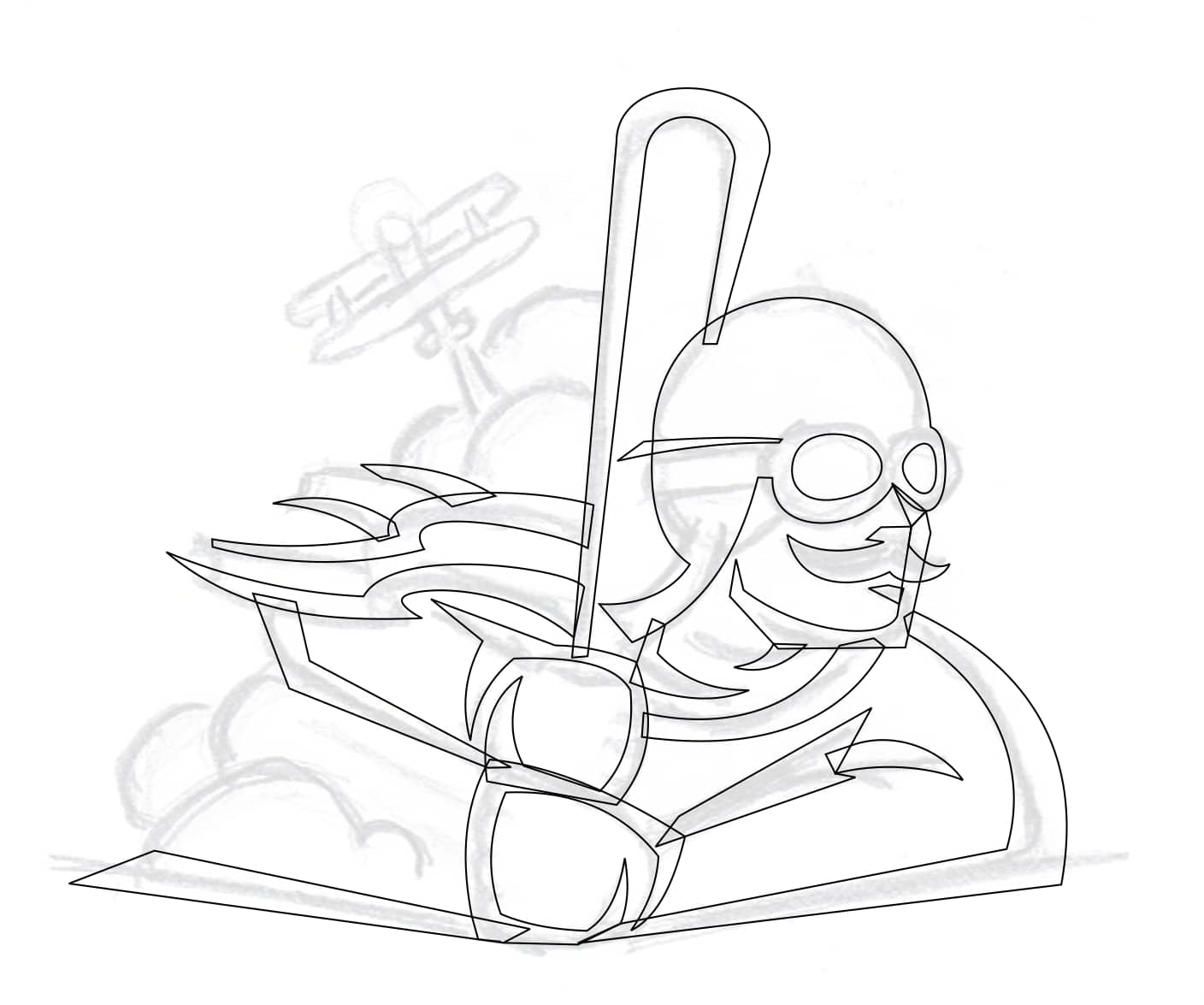
To add curves to the straight lines, select the Shape Tool (Toolbox > Shape Tool or keyboard shortcut F10). With the Shape Tool selected right-click on a straight line and select To Curve. Now you can click and drag on the line with the left mouse button to manipulate the new curve you just created. If you need to move nodes, you can do so by clicking and dragging that node to a new position using the Shape Tool.

I keep working my way around the sketch adding small, simple shapes as I go. It’s important to keep the shapes fairly simple if you hope to create a stylized look and feel.

To create the smoke (or dust), clouds, I simply make overlapping circles. I select the Ellipse Tool (Toolbox > Ellipse Tool or keyboard shortcut F7), then, holding down the Ctrl-key, I click and drag to create a circle.

Next I use the Smart Fill Tool (Toolbox > Smart Fill Tool), to create new shapes from two or more intersecting shapes. Later I can delete the circles leaving behind the new shapes I just created.

Time to create the biplane. This was done by using the Freehand and Shape tools just like before. However, this shape is slightly more complicated than the other shapes I’ve made so far.
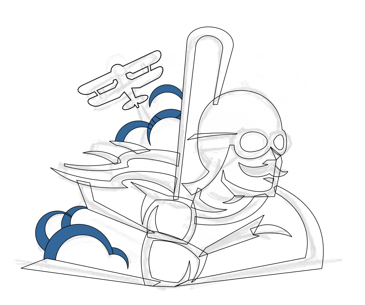
Now would be a good time to add some black fill so we can see how the design is shaping up. I simply selected all of the shapes then clicked on the black color from my Color Palette. At this point if I’m unhappy with anything I’ve created, I can use the Shape Tool to manipulate any of the shapes I’ve created.

Using the tools discussed before, I added a few more details to the design. Once I was happy with the overall design I selected all the shapes. With the shapes selected I clicked on the Weld Button in the Property Bar to create one complete shape.

Next, using the Freehand and Shape Tools I created what will soon become the shading for this design. At this point you don’t have to worry about “closing” these shapes.

I didn’t need to “close” those new shapes because in this step, I used the Smart Fill Tool again.

In this next step I created a boundary then gave it a lime green outline color (so that you can see it for this tutorial). To create a boundary, select all the shapes, then in the Property Bar click the Create boundary icon.

After that I selected only the new boundary shape that I just created and used the Contour Tool (Toolbox > Contour), to create a contour around the entire design

Now it’s time to add some color. Once again I used the Smart Fill Tool to add some new shapes that I would apply color to. With a shape selected, simply click on a color from the Color Palette or create a new color by clicking on the current color square located below in the bottom, right-hand corner of the Status Bar. It was important to have a limited color scheme for this design. So this design has two shades of green, two shades of tan, black and red.

That’s it for the mascot but by simply adding logotype to this design we can create a full identity for this team. The first thing I did was find a font that was close to what I envisioned for this brand. Using the Text Tool (Toolbox > Text Tool or F8), I typed out the name of the team and then selected the font I liked from the Font List on the Property Bar.

That font was close, but I pictured the “S”s being slightly different. So to create new “S”s I typed a capital “O” instead. Then using several of the Shaping Tools on the Property Bar, including Trim, Intersect and Weld and with the help of a few rectangles, I was able to create a new “S”

I added the new “S”s to the lettering, then made the first and last letters slightly larger. But before you do that, you need to break the letters apart and convert them to curves. First select your lettering. Go to: Object > Break Artistic Type Apart. Then with all the letters selected go to: Object > Convert to Curves.

Now it was time to add a little character to these letters. I created small wedge shapes using the Freehand Tool. Then I snapped the shapes to the sides of each letter by making sure Snap to Objects was turned on. Go to: View > Snap To > Objects. Then I used the Align and Distribute feature to make sure all the wedges were aligned horizontally (Windows > Dockers > Align and Distribute or Ctrl+Shift+A), and welded those shapes to the letters. I created more wedges but instead of welding those, I used the Trim feature from the

Next, I used the Add Perspective feature found under the Effects menu to create the following effect:

After that I used the Envelope Tool (Toolbox > Envelope), on the center five letters to add a slight curve to their bottoms. Next, I created 2 lines to act as guides for the “Decatur” lettering.

Then I created two quadrilaterals on either side of “Decatur” using the Freehand Tool. I welded the two quadrilaterals, the “Decatur” lettering and the “Dusters” lettering into one shape. I applied a contour around the new shape using the Contour Tool.

Next, I created an Internal Contour this time and used the Smart Fill Tool to create shapes in the lower section of the lettering.

I now changed the colors to match those in the illustration.

Finally, to finish my mascot logo I combined the two designs.
