The Definitive Guide to Designing a Logo
10 Tips for Making Your Logo the Stand Out Like a Big Brand
Brainstorm Ideas and Getting Started
Creating a logo for your business can feel overwhelming. This first impression is supposed to communicate your business’s purpose, expertise, and mission.
How can an image convey everything you want in a 3x3 inch design?
What exactly makes certain logos stand out among the rest?
The best way to tackle your logo is to break it down into more manageable steps.
1. Keep Your Story in Mind
What do you want everyone to know most about your business? That you’re trustworthy? That you’re professional? Maybe that you are a ton of fun to work with! It’s important to think about what is most important to convey because believe it or not, people will have preconceived notions about your business based on your logo. Think of it as a first impression.
Here’s a good logo to examine:
Take a second and reflect - What did you think when you saw this logo?
It conveys professionalism and innovation. It is effective and timeless. Its simplicity will allow it to be used effortlessly across various mediums. These are all benefits to this logo – let’s keep these in mind as we examine the elements of a memorable logo.
CorelDRAW Free Trial
Start a Free 15-Day Trial Now!
2. Audience
Remember to consider not only what your business provides, but your audience as well. You could be a non-profit that helps children, but your audience wouldn’t be children. Your audience would be adults who have an interest in the wellbeing of children. So be sure to make it appeals to adults but also clearly says, “We help children.”
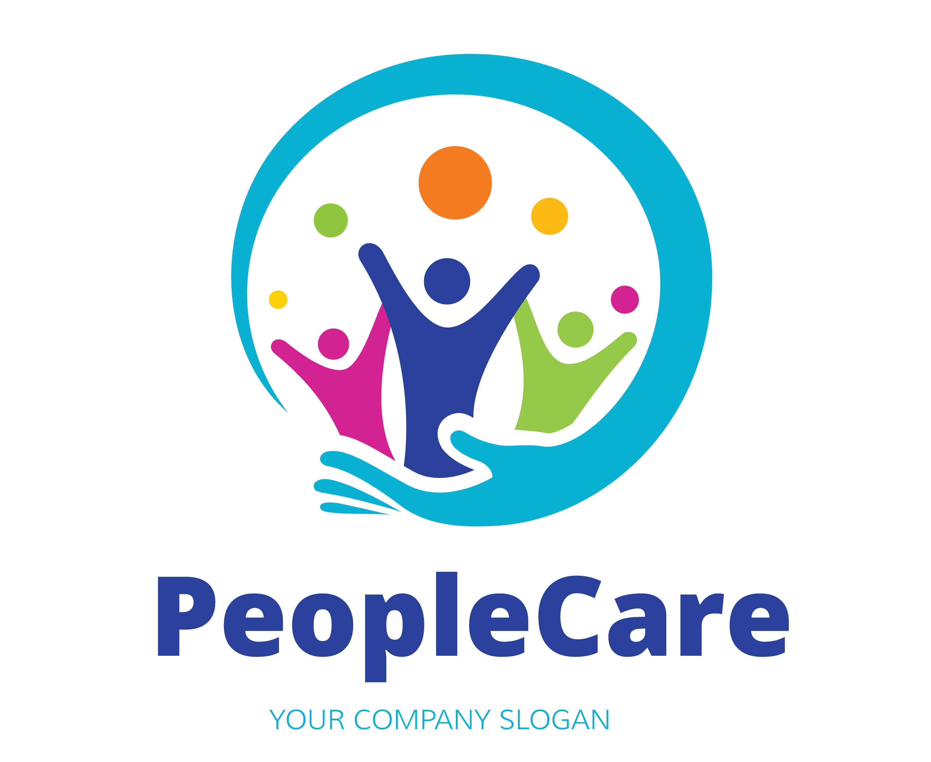
The colors in this example are playful and reminiscent of children. The wrapping arm clearly shows someone with more stability offering support and balance. Finally, the clear font expresses professionalism and trustworthiness. This would be a great logo for a non-profit whose mission is helping children but whose audience are adults interested in children.
Who is your audience? Be sure to keep this separate from those you serve or who your clients are – they might be the same or they might be two completely different groups of people.
3. Shape
Did you realize that there are actually psychological influences behind different shapes and what they communicate to the mind? This can be a powerful tool in choosing a shape for your logo.
Here’s the quick guide to shapes and what they communicate subconsciously:
- Circles and Ovals: Security & Balance
- Ellipse: Modernization & Innovation
- Interlocking Circles: Community & Cooperation
- Triangles: Strength & Stability
- Squares and Rectangles: Professionalism & Capability
- Horizontal Lines: Harmony & Equity
- Vertical Lines: Technology & Elegance
- Diagonal or Angled Lines: Energy & Progress
Here is a great article on the meaning of shapes in design if you are interested in learning more.
The Olympic Rings are a world famous logo where the interlocking circles imply community and cooperation – perfect for the largest global sporting event. (Of course the Olympic logo hasn’t always been as beautiful as it is now)
4. Colors
Similar to shapes, colors also subconsciously communicate and unspoken message to your audience. Check out the list of colors below and pick some that are congruent with the message you want your logo to convey.
- Red: Passion, love, excitement, warmth, anger
- Orange: Energy, change, success, transformation
- Yellow: Happiness, optimism, hunger, cheer
- Green: Money, nature, growth, envy
- Blue: Harmony, focus, loyalty, honesty
- Purple: Royalty, wealth, wisdom, spirituality
- Gray: Timelessness, practicality, neutrality
- Black: Intellect, power, authority, sinfulness
- White: Cleanliness, purity, neutrality, innocence
- Brown: Nature, organics, stability, comfort
- Metallics: Luxury, wealth, quality, prestige
Metallics like gold are powerful when done right but look cheap and terrible when not done well. If you use a metallic like the logo below, be careful that it looks good in both gold but is still interesting in black and white.
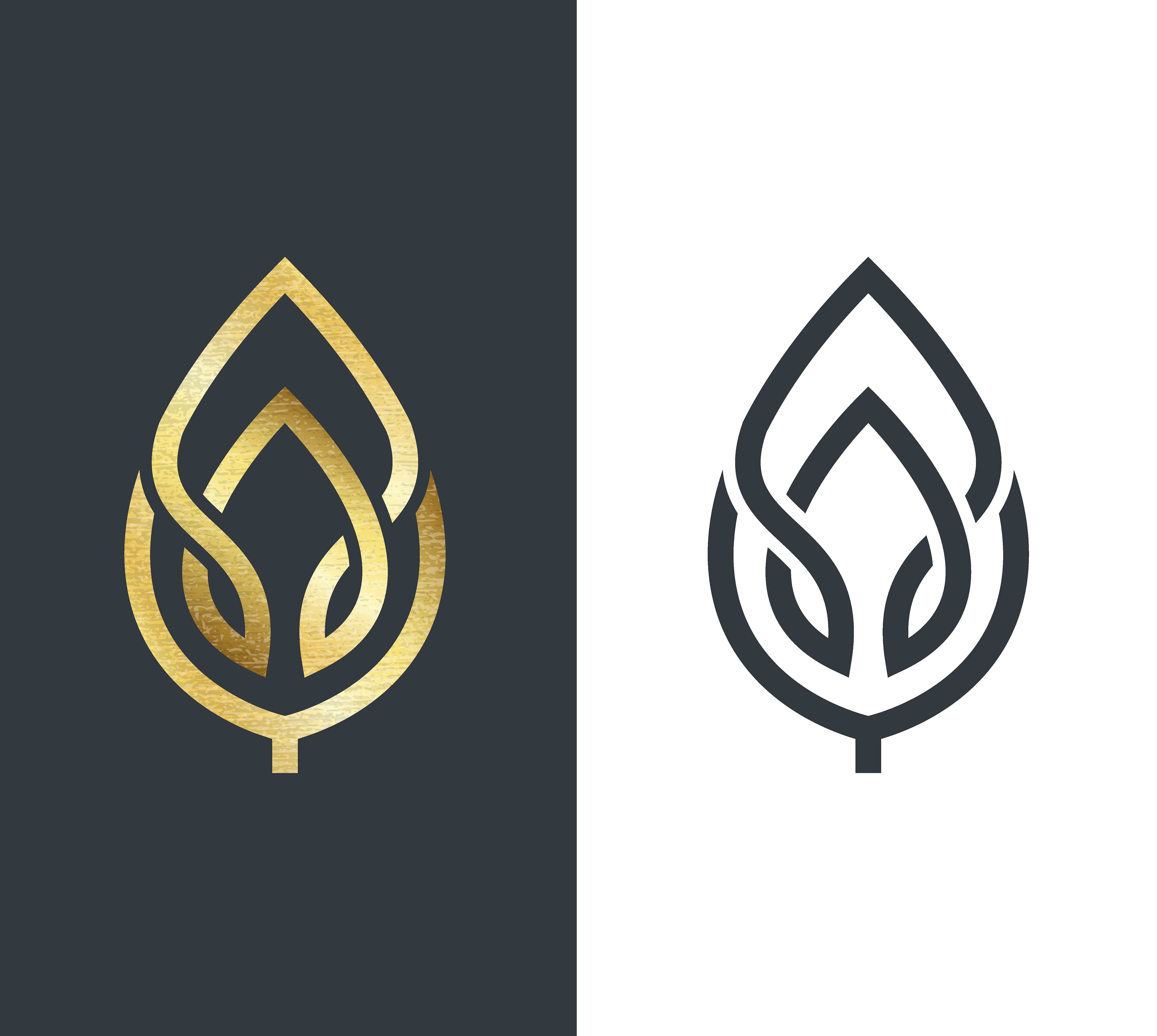
Like most of what we’ve discussed so far, there is a lot more info out there that you can dive into. Here is a deeper dive into color theory for design.
CorelDRAW Free Trial
Start a Free 15-Day Trial Now!
5. Timeless
Trends come and go and you do NOT want someone to look at your logo and think, “That is so 2016.” Be careful to avoid trendy designs, fonts, or colors. Vintage designs and watercolor are very trendy right now and should be used carefully if at all.
Here are a couple of trendy logos and styles that are should not be emulated if you want your design to stand the test of time.
6. Be Original
What makes your business different than the rest? Think of your product, your mission, and your company to stick with concepts that are uniquely yours. You can be original and still keep all other elements listed here in mind to keep your ideas in check. Think of the process of using your product, how it makes someone feel, or even consider the end remnants of what’s left after your product has been used.

This logo is created to look like wine stains from the bottoms of glasses or bottles that are clustered together to form a bunch of grapes. The logo is a creative way to incorporate the act of drinking wine with the origin of the wine itself. It has been formed in a way that it is enjoyable to look at as a work of art.
7. Choose Your Fonts Carefully
You will want to choose a timeless font, but you also want to stand out from the crowd – consider a custom font. Coca-Cola’s logo is a perfect example of this – it is simply their brand name in a custom font. Now anytime someone uses those characteristic “C’s” the viewer immediately thinks, ”Coca-Cola.”
CorelDRAW Free Trial
Start a Free 15-Day Trial Now!
8. Consider Symmetry & Movement
Consider the shape of your logo and how you want the eye of the viewer to move across the design. More symmetrical or balanced logos convey stability and trustworthiness. Logos that have curves or are weighted to pull the eye a particular direction imply energy and innovation.
Take these two bird logos for example:
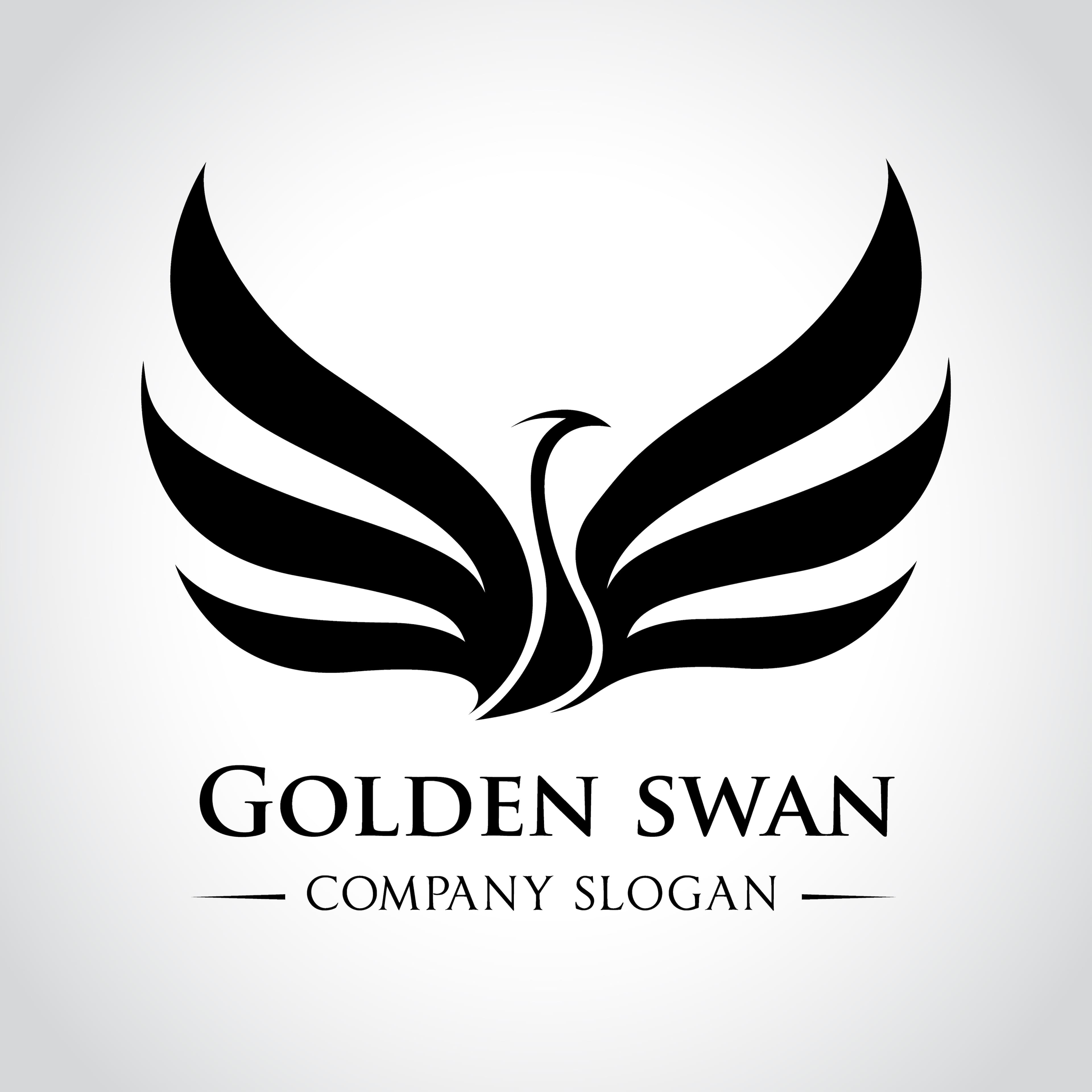
This bird is vertical, balanced, and does not imply movement. It would be best used for a company that wants to make its clients feel secure, like a financial or law firm.

This bird is facing right, unbalanced, and suggests movement. It would be a great logo for a start-up or technology company because it conveys innovation and progress.
9. Versatility
Make a list of all the places this logo will be used, some examples include:
- Website
- Advertisements
- Blog
- Business cards
- Letterheads
- Social media posts
- Printed materials
When you are designing your logo keep the variety of uses in mind. Your logo should look fantastic in color, black & white, and gray scale.
Instagram is a great example of a logo that is versatile and can be used in a number of situations. It looks great in both color and in black and white. They also redesigned the already famous Billabong font, allowing them to have their brand name in a custom font with a nod to the 1970’s.
http://www.adweek.com/adfreak/instagram-refreshes-logo-becoming-instagram-instead-gnstagram-149127
10. Simplicity
Keep your logo simple. Overcomplicating design can lead to confusion and negatively affect the other elements discussed. For example, a complex logo is likely less versatile and more likely to go out of style – this is a good rule of thumb but not a rule. It can be tempting to chase after flowery fonts and elaborate designs, but examining some of the most famous logos today, we can see that simplicity outshines the rest.
Google Chrome, Apple, FedEx, and McDonald's are some of the most recognizable logos today and yet they are all incredibly simple.


Create a Mood Board
Now that you have a couple key components in mind, explore the Internet for logos that communicate elements similar to your concepts. Jot down your list of components you think will be appropriate for you logo such as audience, shape, color, and movement and keep these in mind when you design. This guideline should be a great starting place and help keep you from getting overwhelmed.
We recommend browsing the vast sea of logos after you’ve brainstormed the various elements above. There are so many different logos out there and different messages they convey, you can easily overwhelm yourself if you start your mood board without outlining your concept.
Once you are ready, here are a couple places you can get started browsing logo examples. Keep in mind that not all these are great examples of the concepts we are discussing:
- http://www.awwwards.com/99-creative-logo-designs-for-inspiration.html
- http://www.creativebloq.com/logo-design/typographic-3132206
- https://colorlib.com/wp/flat-logo-design-inspiration
- http://webneel.com/webneel/blog/60-creative-and-brilliant-logo-designs-your-inspiration
Start with a Couple Sketches
Even if you aren’t great at drawing, sketching ideas helps you visualize different elements in your design and will help you come up with a basic layout. It will also help you in organizing your thoughts. Try a few sketches, walk away from your work for a bit, and come back to them to see how you feel about your initial designs. You can use these sketches to stay on track and for inspiration.
Graphic Design Software
With graphic design software suite like CorelDRAW available today, designing your own custom logo has never been easier. There are tutorials galore out there to help you with logo design. You can create custom vector drawings based your concepts that can be used on all the different medias representing your business.
Keep these tips in mind and who knows - you might create the next Nike Swoosh.
