Most of the photographs we take with our cameras, can be turned into something far more exciting and imaginative. I remember walking on the millennium bridge in London, when a local Londoner walking with his lunch date, made a loud comment as if he wanted me to overhear him: "I don't understand why tourists take all these photos all the time". Well this Londoner did miss a point – I may have been a tourist but I always take reference photos as well. This is kind of in my DNA as I never know what my next design & illustration work will be about.
Take this photograph for example, which I took on a trip to the former East Berlin Mitte district in Germany a few years ago. Quite ordinary, right? I walked the streets and came to a bohemian neighbourhood. I took several photos, and this one is the one I will be using for this tutorial, so it came in use.
Looking back at this neighbourhood in Berlin Mitte, I thought it would provide an excellent example of making something ordinary a bit more exiting and imaginative. I always begin by looking at the strong and weaker areas in a photo. They can turn out to be great assets as work progresses during a project.
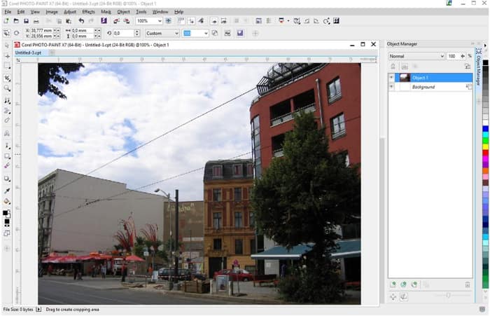
Open the photograph in Corel PHOTO-PAINT X7 and look at where the present lighting is coming from. The lighting is very bland, almost dull. But what is good, is that it's possible to work with the light and shadows and contrasts. I noticed the shadows under the outdoor seating and the tree at the bottom right corner of the picture and will have that in mind later on.
I start by creating a New Object in the Object Manager Docker (Object > Create > New Object), and using the Paint Tool (Toolbox > Paint tool), and a soft edge brush nib to add sun rays. I chose the Art brush > Large Soft from the drop-down list in the Property Bar. I increased the width of the nib slightly using the Nib Size settings in the Property Bar. I now painted 7 sun rays from the sky down onto the street towards the square, using white color. I then adjusted the opacity of the brush stroke object by tweaking the Opacity slider at the top of the Object Manager Docker.
Next, I used the Mask Tool to mask the sky and copy and pasted this (CTRL+C, CTRL+V), to create a Group object with it. This way I only make adjustments to the sky, and not the entire image, when I use the Lens Object Adjustment features.
I make 2-3 duplicates of the mask, so that I can apply different changes to the sky, and quickly turn the specific objects on or off. When I am done, I simply delete any mask objects I don't want to keep. So I will end up with one mask object of the sky. While selected, I applied a Tone Curve Lens (Object > Create > New Lens > Tone Curve) to increase contrast, making dark areas darker and with a rather soft S-Curve (Values in the dialog window: Black approximately 51,54 and White approx. 172, 162).
Also adding a Contrast Enhancement Lens Object effect, placed hierarchically under the Tone Curve object and with a Input Value Clipping of 12 – 255. I now clean up parts of the mask I don't want to keep using the Eraser Tool (Toolbox > Eraser Tool).
I also applied Dodge & Burn effects, increasing shadow effects with the Effects Tool > Dodge & Burn > Burn Highlights, on the windows and facade of the buildings. However, before I use the Dodge & Burn tool I first use the Mask tool to copy and paste those parts of the image, and save them as separate objects in the Object Manager Docker.

On some mask objects I repeated the Dodge & Burn effect like a paint brush. This gives me the freedom to paint the shadows and contrasts on to the image with the Effect tool, like painting with Gouache water colour paint, traditionally used by illustrators and designers before the age of computer graphics. Each coat of the exact same paint, or in this case, each coat of Dodge & Burn, makes it darker. In my photo it makes the plaster and cement look more real and adds depth.
On the red building to the right, I repeated Dodge & Burn quite extensively, adding more contrast, depth and darker shadow. This brings the windows more to life.
Looking at the Parasol just behind the sun rays, I can see that this needs more contrast. I apply contrast using the Effect Tool > Dodge & Burn > and Dodge Highlights instead of Burn Highlights as we used earlier. This lightens up the top of the parasols.
The outdoor awning, over the outdoor tables by the red house to the right, is empty and without any logo or text, which gives me an excellent opportunity to add text or a logo on top of it. I went for "Coffee". With the Text Tool (Toolbox > Text tool), and the color white, I chose a fairly modern bold San Serif font. With the Pick tool selected, I use the distortion handles to shape the text to fit the outdoor awning (click on the Distort icon in the Property Bar). To make it look more real, I applied opacity while I used the Eraser tool to erase anything that would overlap the tree, and make it fit in better. When done, I simply removed opacity from the text. I finished it off by adjusting the opacity of the text object to around 30 using the Opacity slider in the Object Manager Docker.

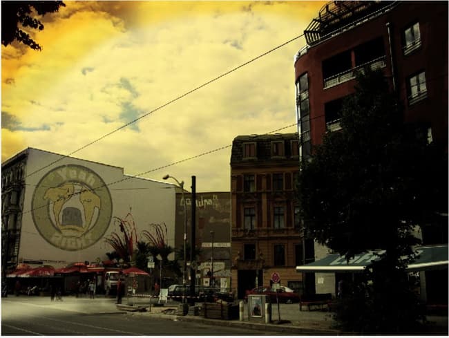
I wanted to add a sort of old, yellow feel to the image, so in the Object Manager Docker I choose Lens Object > Photo Filter Lens (or click on Object > Create > New Lens > Photo Filter). I then continued by adding another Lens Object > Contrast Enhancement, and also a Tone Curve Lens object.
After adding a final, Photo Filter lens, I moved on. All together, these lenses have added a bolder, old yellow, warmer feel to the whole image. And if we now compare our current image with the original, rather dull lighting, we suddenly have a far more interesting feel.
To add a Halftone effect I created another temporary New Image (File > New…). After painting random brush strokes, I added a Halftone effect (Effects menu > Color Transform > Halftone). Meaning I now have a white background object and another with halftone dots. Selecting the Color Transparency Tool in the Toolbar, I dragged it over the white background colour, making the background transparent. From there I simply copy pasted the object over to my Berlin image as a new object. This way I can control where and how the Halftone dots are distributed over my image.

But I wasn't quite done yet as I had the idea of adding something to the empty house facade facing the square. And I came up with a vector image of a dogs face, like a logo or brand. Or Street Art.
I therefore imported (Ctrl+I), my vector dog image. Although it's a CorelDRAW .cdr file in vector format, it's no problem for Corel PHOTO-PAINT to open or import.
Click (don't drag to place the file), and in the Import dialog window make sure that you choose the "Transparent background" option before clicking OK. I imported it as a single bitmap object. I reduced the size by dragging it to size using the sizing handles and with the Pick tool selected, I shaped it into place on the house façade using the Transformation icons in the Property Bar and then adjusting the appropriate handles. It's important to get the perspective correct so it follows the perspective of the wall facade. And then added some textures to it as well. In this case I used Textures in the Effects menu bar. To this, I applied some opacity to make it fit better with the wall.
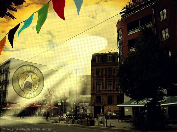
I finished off the image by drawing and painting pennants in various colours using the Paint tool. And once those were finished, the resulting photo was suddenly far more captivating than the first one I took. From something quite unexciting to something far more interesting.