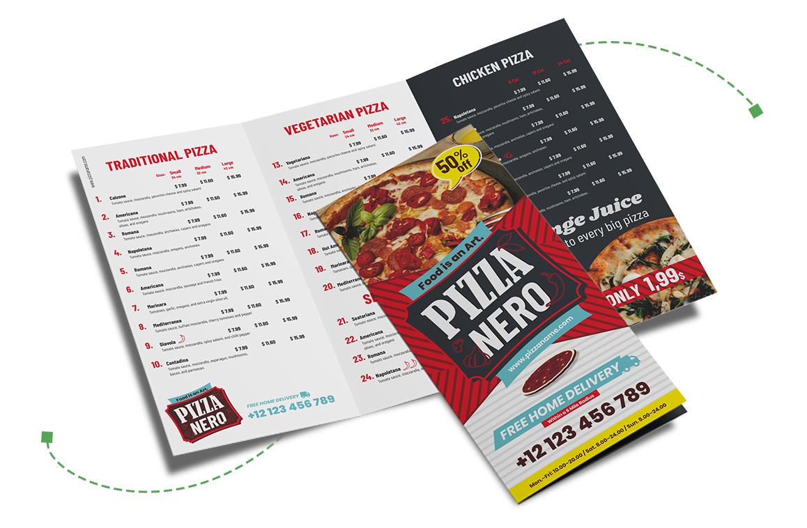
How many times have you been to a restaurant and been the one holding up the table from ordering because you couldn’t decide?
Guilty.
The more choices, the better, right?
While we all like to have a good selection, the reality is that only 16 percent of menu items account for 80 percent of a restaurant’s food sales.
Think about the last time you went to a restaurant and placed your orders with the rest of the table.
Did some of you end up ordering the same thing? Most likely.
That’s not a coincidence! It results from its intentional menu design crafted to lead you to those exact dishes.
When it’s time for you to design your menu, the power of shaping those 16 percent that carry the majority of your sales, is in your hands.
By carefully choosing the colors you combine, the visuals you include, and the font that carries your text, you can impact what dishes will be your bestsellers.
Don’t know where to start? Let me walk you through the key design elements, show you how to integrate brand identity, and provide tips for creating a great menu.
Are you ready to design your restaurant menu? Sign up for a free 15-day trial of CorelDRAW and let the helpful tools make the process easy.
Why are menus so important?
Every restaurant has a story.
That story is told through the restaurant’s website, the decor, the taste and preparation of the food itself – and also your menu.
When designing your menu, it’s crucial to tell the story in a way that resonates with your customers.
Consider the difference between a small corner café and a modern bistro.
The café might use handwritten fonts and warm colors to highlight its homemade meals, creating a cozy, inviting atmosphere.
In contrast, a modern bistro might opt for sleek, contemporary fonts and a minimalist design to reflect its sophisticated, trendy vibe.
Menus can be extremely different as each restaurant has its own story.
As a restaurant, you aim to create a specific experience when people choose to eat with you—your menu should match that.
4 key design principles for a restaurant menu
When designing a menu, you want to craft an experience that speaks to your customers long before they even take their first bite.
Ensuring the menu guides your hungry readers through the choices makes for a good dining experience.
The layout of the menu, the font, the colors, and the visuals you include are all elements that can influence how customers perceive your food and the restaurant as a whole.
Here are some aspects to consider when designing your menu.
1. Layout and organization
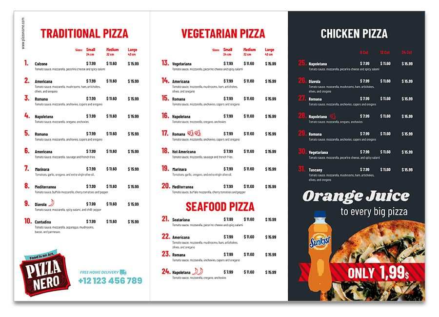
When it comes to your menu layout, you should think of it as a map that guides customers through their choices.
What you don't want is to overwhelm them. Using clear sections is a great tool to avoid that.
Grouping items logically makes everything easy to find. You could group them by type, price, or popularity.
Adding breathing room with negative space helps specific items pop on your menu.
One element to consider in the layout is The Golden Triangle.
That refers to the part of a menu that our eyes typically go to first when browsing.
More specifically, it refers to the top right corner, the top left corner and the lower center of the menu.
Use that knowledge and be strategic with what items you place in the triangle to increase sales on specific items.
Another part of the layout is how you describe your dishes on the menu.
Make the descriptions speak in the restaurant’s tone-of-voice, and have it contributed to the overall dining experience.
When considering the layout, think carefully about whether it can lead to confusion or if it can overwhelm your customers.
Prioritizing clear and transparent pricing in your menu can help avoid that.
2. Typography
The typography a restaurant chooses for its menu contributes to the atmosphere and the dining experience. So, while it may seem like a tiny design element, it has a big impact, which is why it is not a decision that should be taken lightly.
Think about some of your favorite brands. Chances are that you easily recognize the font used in their logos or other brand touchpoints.
And that is exactly what good typography should be: A key part of your brand identity.
When deciding on a font, think about what kind of atmosphere and dining experience you want to create for your customers.
Is it cozy and homey? Or is it upscale and modern?
Whichever atmosphere you are going for, make sure that your font aligns with that feeling.
Italicized fonts are proven to be perceived as more upscale. Whereas handwritten-like fonts make diners believe that the food is healthier.
Want to make your special promotions or bestsellers pop on the menu? Use bold text and other special formatting to draw attention to where you want it.
While you want your menu to be visually appealing, it also needs to be easy to read.
Choose clear, simple fonts with proper spacing to ensure that your customers don't squint to read the menu. That could be fonts like Helvetica, Arial, Montserrat, and Verdana.
You may have seen these classics used a lot, but there is a reason for that. They’re simple, timeless, readable and get the message across without distracting.
Finding the right font is a balance between exploring the creative expression of your restaurant and ensuring readability.
3. Color schemes
The first step in deciding on a color scheme for your menu is understanding the basic psychology behind colors.
Colors aren’t just chosen based on whether they look pretty or not—they speak to the overall atmosphere you are trying to create in your restaurant.
Warm colors such as brown and orange are great for creating rustic, cozy, and homey environments.
Brighter colors like yellow and green can create a fresh and vibrant vibe, which restaurants aiming for a healthy, fresh food image can benefit from using.
Light colors such as beige, white, and light greys create a laid-back and calm atmosphere, which is especially good for casual restaurants or cafes.
Black is timeless and chic, making it the color of choice for restaurants that aim to create a high-end, sophisticated, and luxurious dining experience.
The color scheme you choose for your menu design should align with the color schemes your restaurant follows in other places. Make it fit right into the design of your decor or your website to complete the look and the atmosphere.
4. Strategic use of imagery
You’ve probably heard that a picture is worth a thousand words. That applies to menus, too!
A few well-chosen, high-quality photos that show off your best dishes or seasonal specials can make your menu stand out.
If a menu with pictures doesn't sound like your style, you can consider using vector illustrations instead.
Reflecting your brand identity in your menu
There are several elements that make up your brand identity, and your menu is one of them.
Just as the decor of your restaurant or your website reflects what your brand stands for, the design of your menu should do the same.
By matching the style and design of your menu with your other brand touchpoints, you create a consistent experience of your brand identity.
How to design a menu in CorelDRAW
Let's examine menu design and see how easy it is to create a restaurant menu in CorelDRAW.
Now, the type of restaurant will determine the look and feel.
A cafe or diner menu will look quite a bit different than a 5-star establishment or Chinese take-out location.
With CorelDRAW, you can make your menu ideas come to life—here's how:
1. Open CorelDRAW
First, start by signing into CorelDRAW Web.
Or you can sign up for a free 15-day trial.
2. Selecting the template
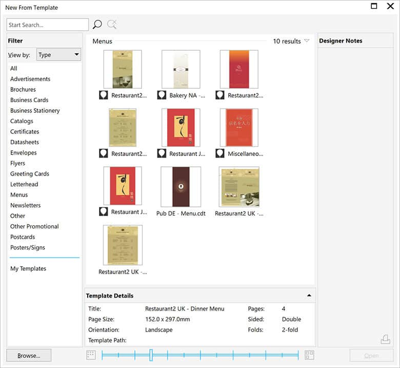
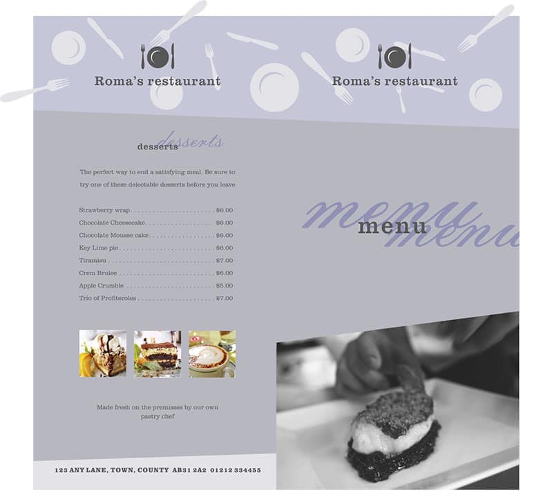
From the Welcome screen, select New From Template and filter by type. Select Menus. I will be using the template Restaurant2 UK - Dinner Menu.cdt.
3. Working with the template
You will start by changing the color.
This template was created using color styles, so changing the colors is very easy.
Open the Color styles docker, Windows > Dockers > Color Styles and click on one of the color styles.
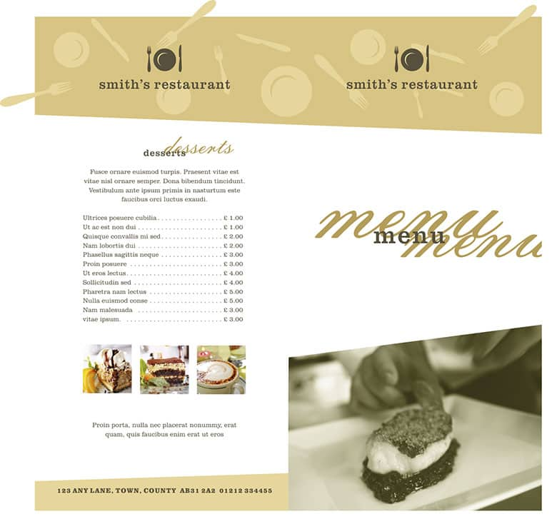
For this template, I have selected the bitmap on the front and converted it to a grayscale image. Now, it is just a matter of changing the text.
4. Outputting the file
As this template is 304mm x 297mm and double-sided, it is best to take the file to a printer for digital output. You can publish the file as a PDF file for easy output.
Crafting the perfect menu
When choosing the right design for your menu, the two keywords you should think about are aesthetics and functionality.
Make your menu part of why your customers leave your restaurant with a memorable experience.
At the same time, it has to be easy for hungry readers to navigate through the selection.
Paying close attention to an organized layout and choosing branding that reflects your identity pays off.
Remember to keep your menu updated in terms of pricing and branding to ensure it continues to reflect your restaurant's personality.
