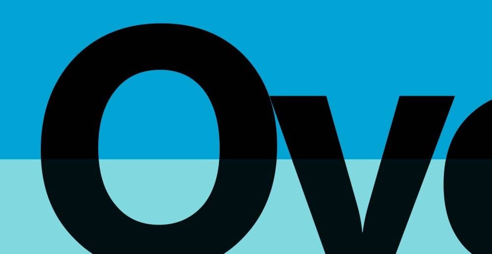
Black is the most important color in CMYK printing. The name CMYK itself is an acronym of the inks used for print: Cyan, Magenta, Yellow and Black, where “Black” is represented by the last character K for two reasons: first, to avoid confusion with “blue”, and secondly, because “Black” is also called the “Key color” since it’s the most important color in CMYK printing. Most companies print Black first (K-C-M-Y) and several printers say: “if the black has printed fine, the whole job will be OK, but if the black fails, there’s no way to repair it”.
The importance of black in printing is also the reason why it is one of the most difficult colors to print, and why we need to learn how to manage it correctly.
RGB Black vs CMYK Black
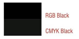
As you are probably already aware, your monitor and web pages use a different color mode to print, called RGB (Red-Green-Blue), based on the primary colors of visible light. In this color mode, “black” means “dark” or “no light”, and it’s represented as a zero value of all of the three colors: R:0 G:0 B:0. And of course, it appears as a very dark tone, the darkest posible on your monitor.
But CMYK Black is a very different concept. Here we are mixing colors through the printing inks. This is known as the subtractive color method. Subtractive color mixing means that as color is added, the result gets darker and tends towards black. However, because it would be almost impossible to achieve pure black using only cyan, magenta and yellow, the CMYK Black is added to the other inks. (In comparison, RGB (colors as seen on a monitor screen), is an additive color mode, which as colors are added, gets lighter and tends towards white).
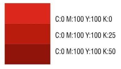
For example, to create “CMYK Red” you should use Magenta + Yellow. If you add Black, the color becomes darker.
But there is one problem: CMYK are called “transparent inks” (actually, they are translucent), which helps when printing each inks over other. This means that the 100% Black CMYK is not a solid dark area (the same happens if you create a gradient from any color to black, the shades are gray and look diluted). There are other similar situations, for example when we want to put a grayscale image over a background. We will talk about how to solve those situations.
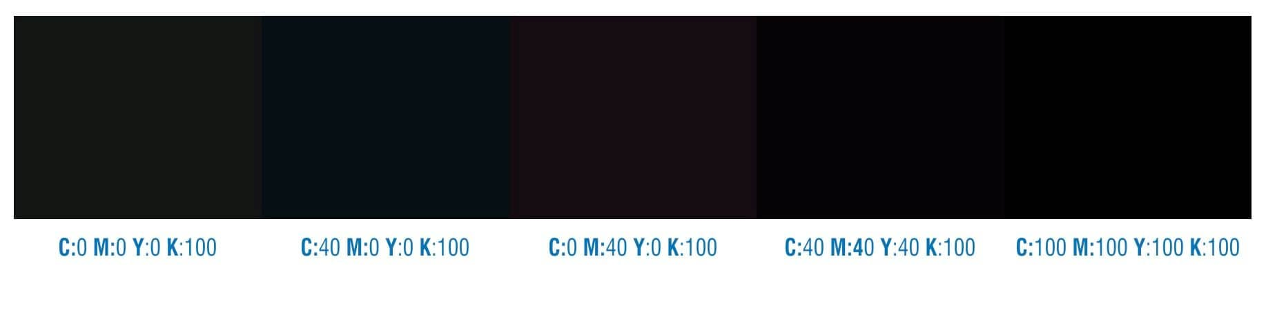
If you create a background or a big área, filled with CMYK black, you will notice that the color is not as dark as we would expect. Since CMYK use values from zero to 100% you can’t add more than 100% of each ink, but the result still seems to be more of a dark gray. The most common solution is to add one or more of the other CMYK colors, for example 40% or 50% of Cyan (C:40 M:0 Y:0 K:100). If you use 40%/50% of magenta instead Cyan, the result will be a warm black. A better solution is to add 40%/50% of the other three inks, (C:40 M:40 Y:40 K:100), which will result in a nice dark and neutral black. Those values are called a “Rich Black”, that means “a mix of Black + other colors”, as compared to “Pure Black” (CMYK Black only, C:0 M:0 Y:0 K:100)
If you apply a Fountain Fill from “Pure Black” to another color, sometimes you will notice that the color is washed out and doesn’t look good, it seems more like a pale gray.
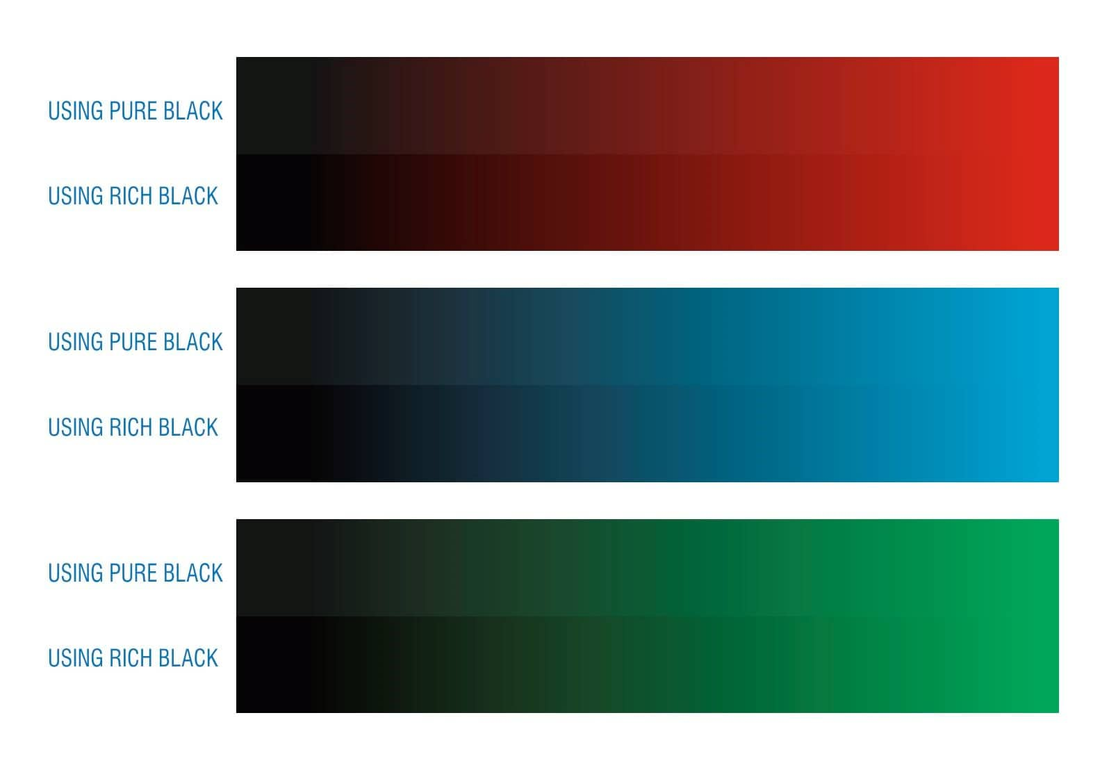
The solution is to use Rich Black instead of Pure Black. You will notice a big difference (on your monitor and also in the printed result), if you apply a Rich Black. For example, if you are using a gradient from 100% Black to 100% Cyan, you will get a better result if you use 100%Black+100%Cyan to 100% Cyan instead.
Some people use the Max Value (C:100 M:100 Y:100 K:100) because it looks very dark on the screen, very similar to how the RGB Black looks. But that can cause several printing problems, especially with big areas and/or backgrounds. Since each color requires a drying time, using only pure colors requires more time to print and most of the times cause unwanted errors in the print.
The biggest advice is NEVER to use this color for print. Most of the color profiles include a limit for the “Total Ink BillingCountry ” (the addition of the four inks). If the Max value for total Ink is 400% (100% of each), color profiles limit the Total Ink from 300% to 340% (adding the four inks). For example, some color profiles convert 100% of all inks to 75% cyan + 75% Magenta + 75% Yellow + 95% Black, in order to produce 320% Total ink.
Not all jobs are the same. For example, if you need to print a job that uses only Black and Red, it will be more easy, fast and cheap to use two inks instead four. In this case, the most common colors used are the Pantone color palettes. There are several Pantone color palettes, according to the kind of paper (Coated, uncoated) or the kind of job (Textile, fashion, etc.).
Most of the Pantone inks are opaque, while the CMYK inks are translucent. This can be a great advantage. If you need to print a plain color, for example, using Black: you don’t need to use anything more than just Pantone Black for a perfect BillingCountry. Unfortunately, if you add the Pantone color to a CMYK job, that means you’ll be using five inks and the cost will be increased. However, sometimes the use of an extra-ink is the only solution for getting the exact result, for example if you need to use a bright color, a fluorescent tone, a metallic ink (gold, silver, etc).
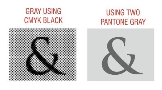
It also could be useful if you need to use a shade of the color. If you need to use a gray, you can use a shade of CMYK Black, such as 10% black, 20%, etc. The output will be composed of small dots, that create the illlusion of the gray tone. But if you need to use a real gray, on a background or any other object you can use a Pantone color, such as “PANTONE Cool Gray 1 C”, and that will be a plain, solid layer of this color. The difference will be more visible after printing, especially when examined using a magnifying glass.
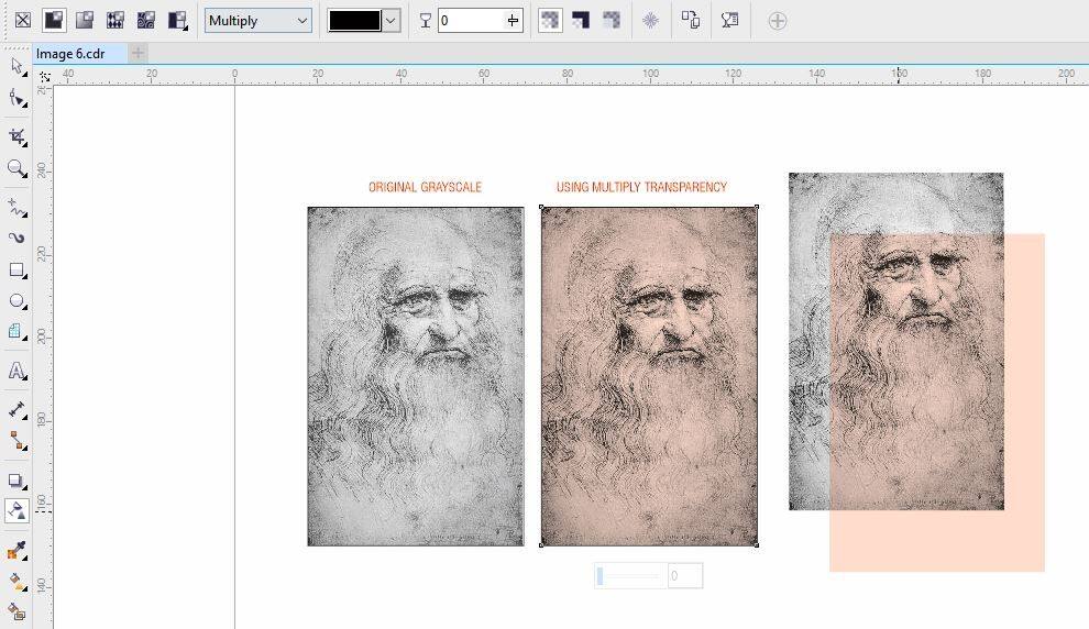
Sometimes we need to use a grayscale image, that uses only Black, but need to add some color to the image. A fast and nice solution could be to place the grayscale image over a colored background, select the Transparency Tool, and choose “Uniform” Transparency in “Multiply” mode, with 0% transparency on the Property bar, The result should remove the White areas of the image, leaving a transparent black image that could be used over any background. Anyway, the output will be an overprinted black over the colored background.

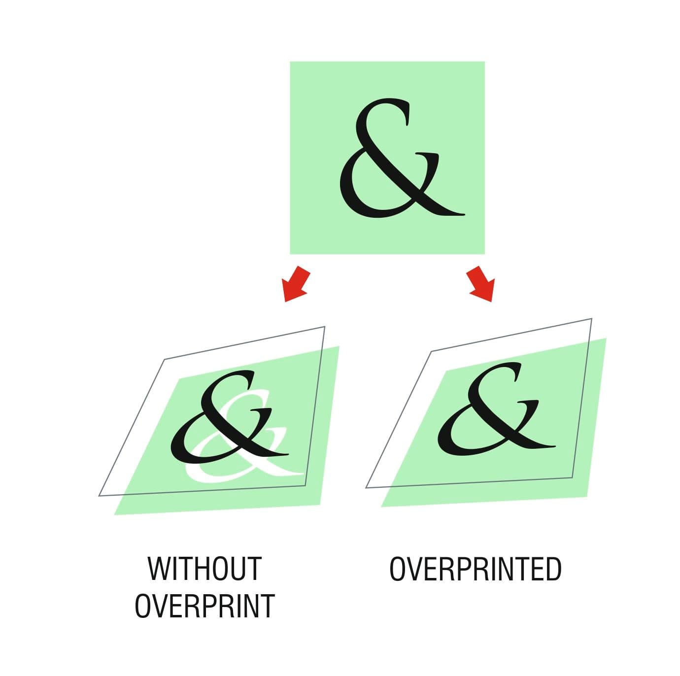
Frequently we hear about the importance of “overprinting” black, but not all people understand what this means and why it is so important. Try to imagine that we want to print a black text over a green background. If you don’t use overprint black, on the color separation there will be a white hole on the background and the text would need to be printed exactly in the place to fill this gap. But printing machines are not always so exact. The paper suffers stretching, and due the speed of printing there could be a small difference. The result could be an unwanted white line between the text and the background. That’s not only bad for quality, it also could make it difficult to read small text. The solution is to set “overprint black” on output. It’s specially important for thin lines and small text. And, since the black is added to the background color, it will look even darker, make it more visible.
Anyway, take care when you use overprint objects on the document. It’s a very useful option for small text and thin lines but if you choose overprint with bigger objects and the background is not uniform, the result could be wrong. Remember that CMYK black is not opaque, then if the background has different tones, this will be visible after printing. The same warning goes if you choose manually to overprint the fill or outline of objects with other colors. It’s very important to enable “Simulate overprints” on the View menu.