CorelDRAW
You’ve put effort into your Facebook profile.
The profile photo is sharp, your bio says just enough without trying too hard, and your pinned post still pulls in reactions.
But your cover photo? It’s either the default grey or something that hasn’t aged particularly well since 2018.
It’s time to give it the attention it deserves.
Your Facebook cover photo is prime visual real estate and not just empty space.
Whether you're managing a page, growing a group, or just want to look like you didn’t join yesterday, your cover photo sets the tone before anyone clicks, scrolls, or reads a word.
In this post I’ll break down what actually makes a cover photo good, from sizing quirks to layout choices and branding best practices.
Design the perfect image for your Facebook page with CorelDRAW Go. Get your free trial today!
You’ve got your name. You’ve got your profile pic.
But what’s the first thing people actually see when they land on your Facebook page, profile, or group?
That massive horizontal image at the top.
That’s your Facebook cover photo — and it’s doing more work than you might think.
Whether you’re running a brand, building a creator presence, or managing a community, your cover photo is one of the most visible parts of your profile.
It’s the visual intro to whatever you’re trying to say, sell, or share.
It can set the tone, spotlight your brand, or completely turn people off if it’s blurry, misaligned, or clearly hasn’t been touched since 2016.
In short: it matters. A lot.
Facebook might not be the hottest platform on the planet, but it’s still a major player — especially for communities, campaigns, and pages that convert.
And that header space? That’s prime real estate.
A strong cover photo can:
Even Facebook says it’s one of the most important pieces of your page layout.
So, if you’re treating it like an afterthought, you’re already behind.
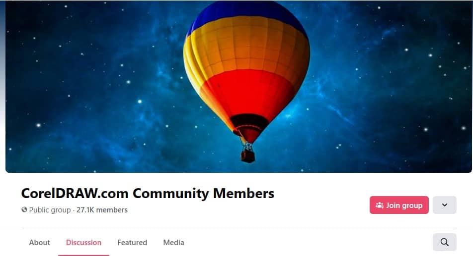
Take a look at the CorelDRAW Facebook group — a community for fans of CorelDRAW.
The cover photo nails the essentials:
You don’t need a degree in graphic design to create something that works. You just need a clear idea and the right tools.
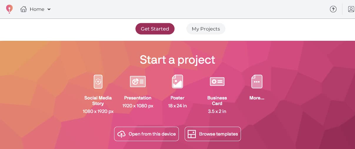
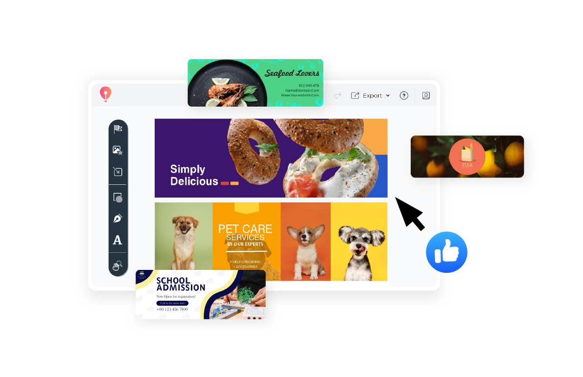
CorelDRAW Go comes pre-loaded with cover photo templates that make all of this a lot easier.
Let’s start with the math (don’t worry, it’s basic).
According to Facebook, your page’s cover photo should use a 16:9 aspect ratio and align to the left with full bleed.
The minimum size is 400 × 150 px, but for best results, Facebook recommends uploading an sRGB JPG file at 851 × 315 px — the classic desktop size.
This 16:9 ratio ensures that your layout displays consistently and avoids distortion across most screen sizes.
If you're uploading high-res images, scaling proportionally from 851 × 315 (e.g., 1702 × 630 px) also works well.
CorelDRAW Go’s Facebook templates already follow these dimensions. Use them — they’re pre-built for this exact kind of chaos prevention.
Here’s where things get complicated.
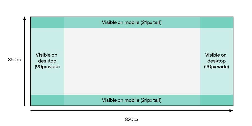
Even though Facebook recommends 851 × 315px, mobile devices crop differently, often showing taller portions of the image.
This means that if you design only for desktop, important content may get cut off on phones.
To avoid this, designers often use a slightly taller canvas, like 820 × 360 px, and keep essential elements within a centered safe zone (typically around 640 × 312 px).
This hybrid size helps preserve content visibility across devices.
Here’s a cheat sheet for practical design:
Ah yes, the dual-screen dilemma.
Same image, two completely different crops—and therefore looks.
Your Facebook cover photo shifts depending on the screen it’s viewed on — and that shift can sneakily chop off the good stuff if you’re not careful.
That leaves a shared, centered space of about 640 x 312 px — a.k.a. your design safe zone. That’s where your logo, CTA, tagline, or any key visuals should live.
Use it wisely, and your cover will look great across every screen. Ignore it, and you might end up with a half-logo and a cut-off sentence.
If you want to skip the setup and get straight to designing, CorelDRAW Go has templates built to these specs — no guessing required.
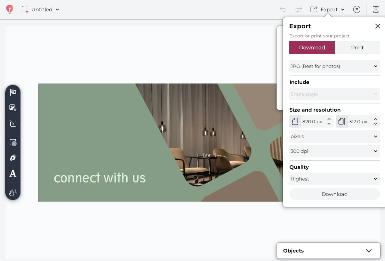
Let’s say you’ve got your concept. You’ve opened CorelDRAW Go. You’re ready to make design magic happen.
Here’s how to go from idea to live Facebook banner — in five easy steps:
CorelDRAW Go has them built in. Open the app in your browser and choose the template labeled “Facebook Cover Photo.” That’s your shortcut to perfect sizing.
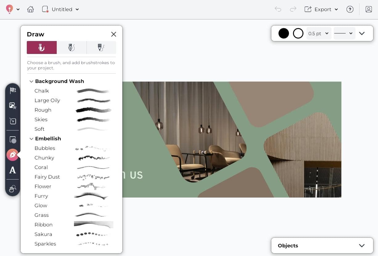
Upload a background image or graphic. Add your logo, tagline, or promo text.
Use CorelDRAW Go’s drag-and-drop tools to position elements exactly where you want them, and make sure your key content is centered.
Save your image as a JPG or PNG file. Aim for under 100 KB to ensure it loads quickly on Facebook.
Head to your page or profile. Hover over your current cover photo.
Click “Edit cover photo” → “Upload photo.” Select your new design, adjust the crop if needed, and hit “Save”.
Don’t skip this step. Make sure nothing got cut off in the upload process. If something looks off, tweak and re-upload — it only takes a few seconds.
Your cover photo is the first thing people see, so maybe don’t make it a sunset stock photo.
Here’s how to stand out (for the right reasons):
Facebook doesn’t care about your carefully positioned text.
Mobile crops the sides. Desktop trims the top and bottom.
Solution? Keep your key content smack in the center. CorelDRAW Go’s templates already know this. Trust them.
This isn’t a collage contest. Pick one focal point. One visual. One headline.
Too many layers = zero impact. Your audience should get it in one glance — not need a map.
If your profile pic is all clean and corporate, don’t slap a chaotic graphics jungle up top.
Consistency builds credibility. Your cover photo should feel like it’s from the same planet as the rest of your brand.
You don’t have to include a call to action, but if you do — keep it light.
Try:
“Explore more”
“Join the community”
If it looks like a sales billboard, people will scroll like it’s one.
Neutral is fine. Boring is not.
Bright, high-contrast visuals grab attention, especially on mobile. But stay on brand. This isn’t your moment to experiment with radioactive green (unless that’s your thing).
Unless it’s your team, please skip the handshake photos and fake boardroom smiles.
Use real images. Add branded graphics. Or at the very least, make your visuals feel like someone made a choice, not just picked a slide from Google Drive.
New launch? New season? New you?
Swap in a new cover. Refresh it quarterly, or whenever your goals shift.
This is one of the easiest visual updates you can make — and most people ignore it.
Your Facebook cover photo should look like you still use Facebook.
And if you’re designing with CorelDRAW Go, you already have the tools to make it scroll-worthy and device-friendly.
Want more technical do’s and don’ts? Check out Meta’s official cover photo guidelines.
Sometimes the best inspiration for your Facebook cover photo comes from the brands doing it right.
Below are a few standout examples, and what makes them worth getting inspired by.
LEGO’s cover photo captures action. With mini F1 cars in motion, bright track visuals, and playful characters, it tells a full story in one glance.
This is visual branding at its most energetic. It’s bold, colorful, and screams LEGO without needing a logo front and center.
Takeaway: Use movement, not just product shots. Your banner should tell a story in a split second.
This cover photo leans fully into what the brand stands for — fresh, whole ingredients.
The vibrant produce circles a rustic wood texture, forming a natural frame with a clear focal point.
It’s colorful without being chaotic, and immediately communicates what HelloFresh offers, without saying a word.
Apple’s Facebook cover photo for the iPhone 16 Pro is a masterclass in minimalist branding.
A glowing product image sits front and center on a matte-black background, with crisp, futuristic typography that says everything without overexplaining.
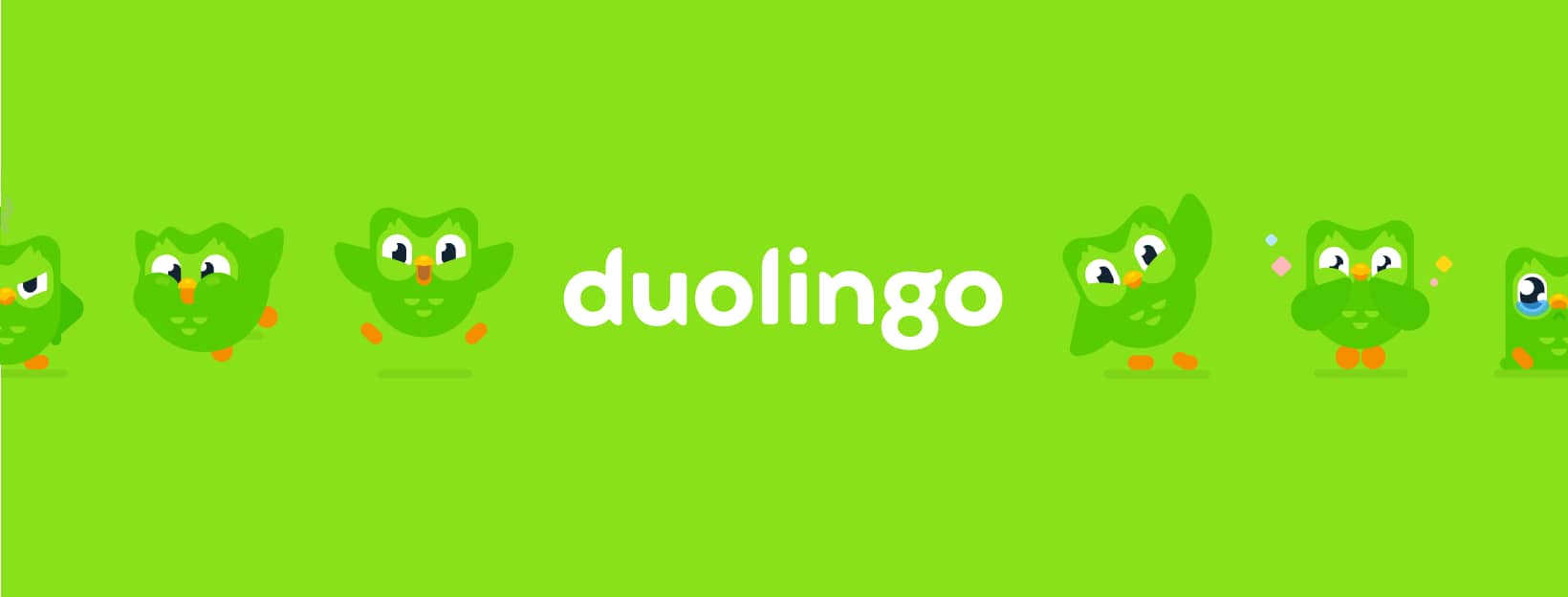
Duolingo’s Facebook cover photo is pure brand energy: bright green, full of emotion, and unmistakably Duo.
Instead of pushing a product, they let the mascot’s personality carry the message: fun, bold, and totally on-brand.
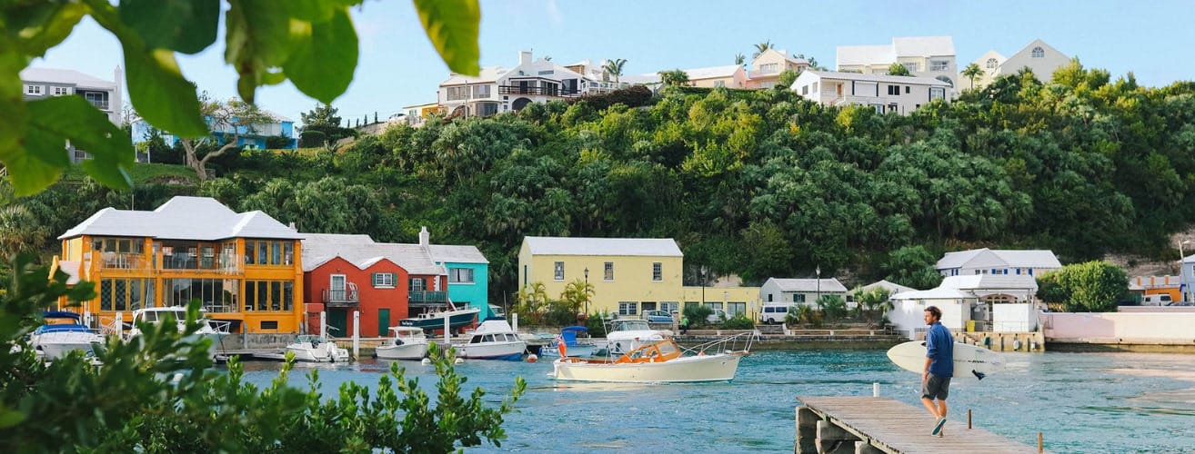
Airbnb keeps things aspirational but grounded with a Facebook cover photo that feels like a postcard come to life.
The mix of colorful waterfront homes, boats bobbing gently in the water, and a surfer heading out sets an immediate mood: relaxed, local, and full of possibility.
The scene showcases Airbnb’s core brand message: feeling at home anywhere in the world.
It also follows several best practices: high-resolution photography, natural composition, and no overcrowding.
The text-free layout lets the image breathe while keeping it versatile across mobile and desktop.
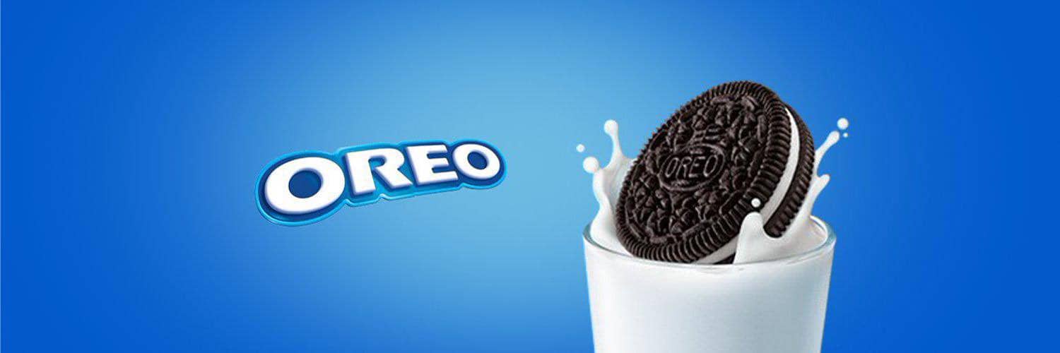
Oreo doesn’t overcomplicate it. One cookie, one glass of milk, and that signature splash — it’s instantly recognizable.
The playful simplicity nails brand recall and makes the product the hero, right where it belongs.
Here’s the part where I remind you that you don’t need to be a graphic designer to create something scroll-stopping.
With CorelDRAW Go, you can design directly in your browser—no downloads, no experience required.
Start with a pre-built Facebook cover photo template or build your own from scratch.
CorelDRAW Go makes it easy to customize every element with drag-and-drop tools, curated fonts, brand color support, and export options tailored for Facebook.
Whether you’re working on a tight deadline or just want to experiment with layout options, CorelDRAW Go gives you full creative control.
Want to create a high-quality Facebook cover photo that works across devices and captures your brand story?
With CorelDRAW Go’s free trial, you can get started in minutes using built-in templates and smart layout tools.
Emilie Schäfferling is a storyteller who blends data-driven insights with creative expression, turning complex ideas into clear, engaging narratives that make even advanced information accessible to a wide audience.
With a background in creative disciplines, Emilie has a unique skill set that helps her break down complicated concepts into meaningful, concise insights. Her storytelling approach serves a dual purpose: simplifying information while connecting with audiences on a personal level.