You walk into a restaurant, starving and ready to sink your teeth into a delicious meal.
The waitress hands you their menu, and as you sit down, eager to look through the selection to feed your growling stomach, you see that the top of the menu is entirely blank.
There is no logo, name, or sign of what the restaurant is or what it stands for. It is just a list of dishes floating in an empty space.
Weird, right?
Now, imagine you're scrolling through Facebook when an ad catches your eye. Something about it sparks your curiosity, so you click through to the company’s website.
But when you land on the page, you're met with no header, colors, or logo—just a blank, empty void.
Feels... off. Unfinished. Almost untrustworthy.
Whether you realize it or not, our brains are wired to seek visual identity. In fact, up to 90% of the information our brain processes is visual.
When that’s missing, something feels wrong.
The same is true for the YouTube banner on your channel.
Your banner, also known as YouTube channel art, is the digital welcome mat, the first handshake, and the sign above the door that tells people who you are and what you’re about.
If it’s missing, blank, or uninspiring, it creates uncertainty. And in a world full of choices, where YouTube hosts over 113.9 million channels, uncertainty is the fastest way to lose attention.
When someone has made it to exactly your channel in the ocean of mukbangers, viral challenges, and gaming streams—don’t disappoint them! Leave them with something memorable.
A bland, generic design, or worse, no banner at all, won’t cut it.
Your banner is your chance to tell your story before viewers even click play. Make it count.
Many brands overlook the YouTube banner, and too many channels don't even have one. This is a huge missed opportunity, but by following this guide's best tips and tricks, that won't be you.
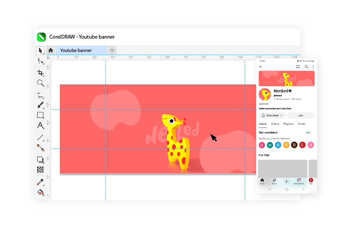
Don't let your YouTube banner be an afterthought. Easily create yours with a free 15-day trial of CorelDRAW—your intuitive YouTube banner creator.
How to choose a design that meets the YouTube banner size requirements
Sure, your banner needs to be strategically thought-through in terms of colors, copy, and the story it's trying to tell, but some technical design requirements need to be met first for that to shine through.
If you’re interested in learning how to design a YouTube thumbnail, head over here.
Resolution
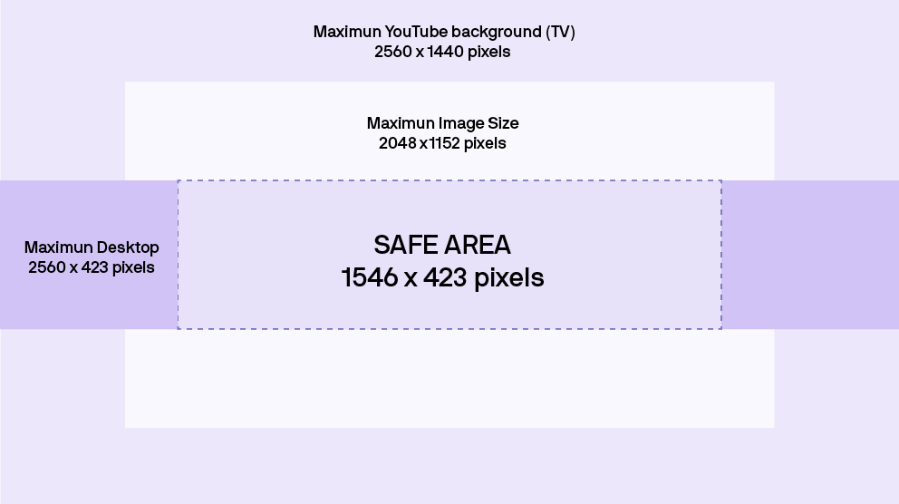
In order for your banner to shine bright and have the user see a quality as high as your content, the ideal banner size is 2560 x 1440 pixels.
It can be up to a maximum of 4800 x 2700 pixels but aim for the ideal size.
Although that is the ideal resolution, keep in mind that your banner will display differently across devices.
Here is an overview of what that looks like:
- Banner in desktop display: 2560 × 423 pixels
- Banner in tablet display: 1855 × 423 pixels
- Banner in mobile display: 1546 × 423 pixels
- Banner in TV display: 2560 × 1440 pixels
I know it sounds a little overwhelming, but this does not mean you have to design several banners!
Especially since you can only upload one file, you want to make sure that one banner works across devices.
You need to be aware of where you place your text and important elements and ensure that those display ideally on all devices.
The 'safe area,' meaning the area that is visible across all devices, is 1546 x 423 pixels for YouTube banners.
Minimum width
The minimum dimensions that YouTube can work with are 2048 x 1152 pixels, but if you want to swoop your viewers, aim for the ideal dimensions mentioned above instead.
Aspect ratio
The banner should meet the 16:9 aspect ratio, similar to most average long-form YouTube videos.
File size
Use a high-quality image, which most likely means a bigger file size. As long as you keep it under 6 MB, you are good to go.
File format
The supported file formats include JPG, PNG, BMP, and non-animated GIFs.
5 tips for designing a YouTube banner
Your banner gives viewers an introduction to what your channel is, what they can expect, and why they should stay on the channel.
That is, if you are smart about how you create your YouTube banner.
As with many other assets, it needs to be attention-grabbing—something that is especially important on YouTube, where you compete with billions of videos.
But you also want to stay true to your brand and give your viewers a cohesive experience, meaning that what they encounter in an ad is the same as what they see on your YouTube banner or your social media, etc.
Here are the five most essential tips to keep in mind when getting started with creating your YouTube banner.
1. Make sure you take technical requirements into account
You may have designed a cool and creative banner like a professional, thinking you’ve nailed it, but none of that really matters if it doesn’t meet the technical requirements.
If the resolution or width doesn’t align with those requirements, it can distort your messaging, throw off color coordination, and ruin the awesome text you spent hours perfecting.
A good place to start when designing a YouTube banner is to ensure that the blank canvas you’re working on meets the required dimensions.
If you’ve already forgotten what those are, just scroll back up in this blog post.
2. Brand consistency
As mentioned, your YouTube banner sits at the top of the page, making it one of the first things your viewers see. Make sure it aligns with your brand in terms of font, colors, and overall tone.
When your banner, thumbnails, and other visuals stay consistent with your brand’s style, it creates a sleek, professional look and ensures your viewers instantly recognize your brand.
3. Clear CTAs
Although a YouTube banner doesn't necessarily need text, it can be a good way of drawing your viewers in and making them aware of new releases, new products, and new videos, of course.
Use the text on the banner to encourage your viewers to click on your newest video or perhaps a new playlist you have created.
You can nudge them even more by adding arrows in your banner pointing to these videos and playlists.
4. High-quality images
If a movie poster is pixelated, does that affect your decision to watch the movie?
Potentially.
Don't let poor quality undermine your message and brand perception.
Use a photo editor solution to ensure crisp, high-quality images for your YouTube banner design.
5. Pique their curiosity
You want viewers who may not know you yet to become intrigued and get to know you better.
Add elements to the banner that make them want to stay on your channel and keep scrolling down to your actual content.
One way to do this is by using your banner space to announce updates like new product releases, new events, and, of course, new videos.
If they lose interest just by looking at your banner, you are losing them too early, and the banner isn't serving its purpose as it should intrigue them even more.
10 examples of YouTube banners from brands
1. Universal Studios
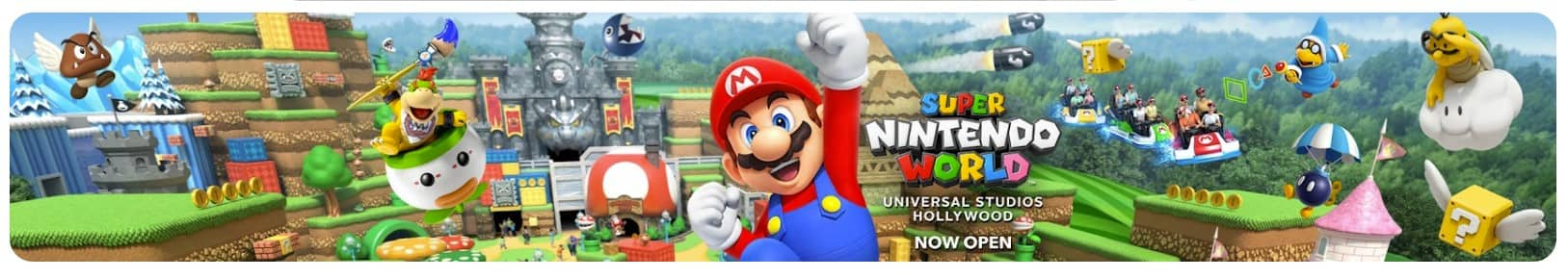
Universal Studios perfectly utilizes the YouTube banner as extra ad space by dedicating its banner to highlighting the opening of a new Super Nintendo World.
2. Costco
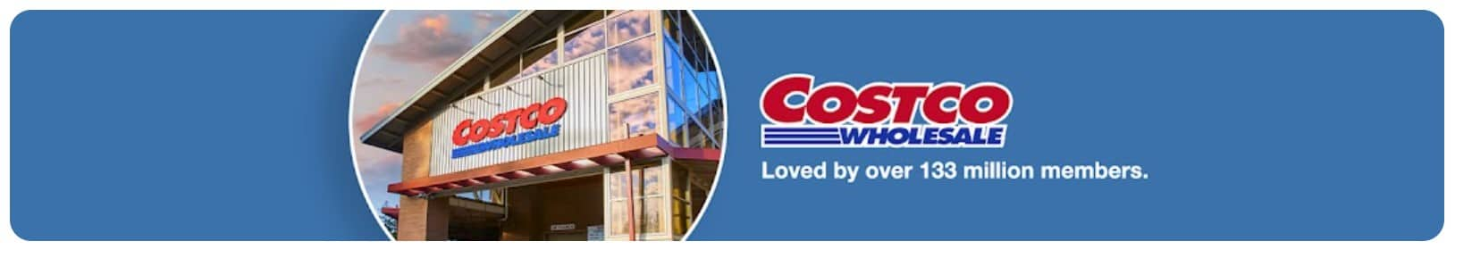
Costco’s banner nails it—it’s clean, on-brand, and instantly recognizable. The bold colors and sharp images scream Costco, making it feel familiar and legit. No clutter, just a clear, pro look that tells you what to expect.
2. Zoho
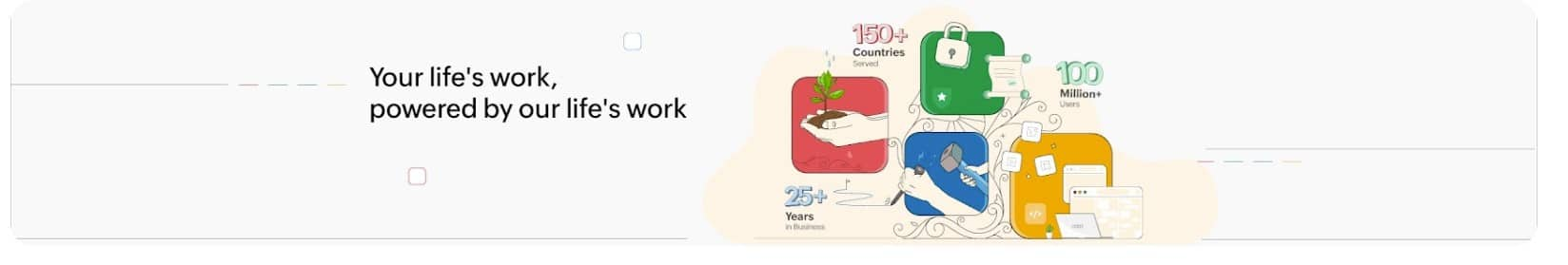
Zoho plays around with its brand and logo colors in the banner, giving people enough to recognize the familiar colors while adding some valuable and eye-catching data.
4. G2
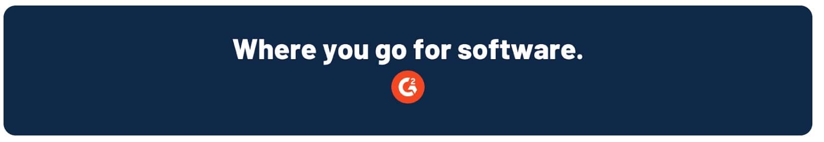
G2 keeps it simple and bold—and they do it so well! No need for fancy elements or a bucket of icons. What they offer is conveyed through a self-explanatory tagline, making the banner simple and strong.
5. Epicurious
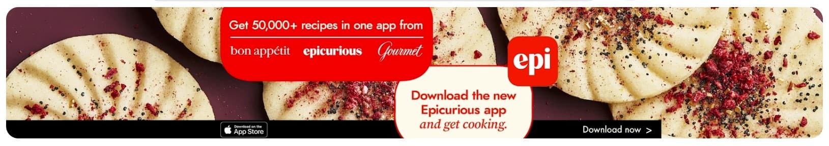
If this banner leaves you feeling a little hungry, you are not alone—Because that is exactly what it wants you to feel!
Not only has Epicurious chosen a high-quality, mouth-watering picture for their banner, but they have also taken full advantage of the space to add a powerful CTA.
6. Nike
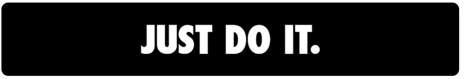
The well-known and recognizable font, the stylish black and white combo, and the slogan that most of us know, like the back of our hand, are all Nike needs to make an outstanding banner for their YouTube channel. No notes.
7. Nintendo
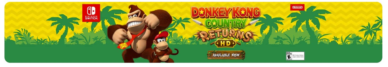
Nintendo brings another great example of how to use the space to advertise a new launch, rather than settling for a generic, one-size-fits-all banner.
8. HubSpot
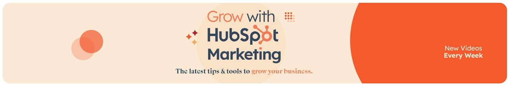
HubSpot's banner is an excellent example of how to utilize copy to not only explain what their channel offers in simple, understandable terms (tips and tools to grow your business) but also tease that they release new videos every week.
9. Disney
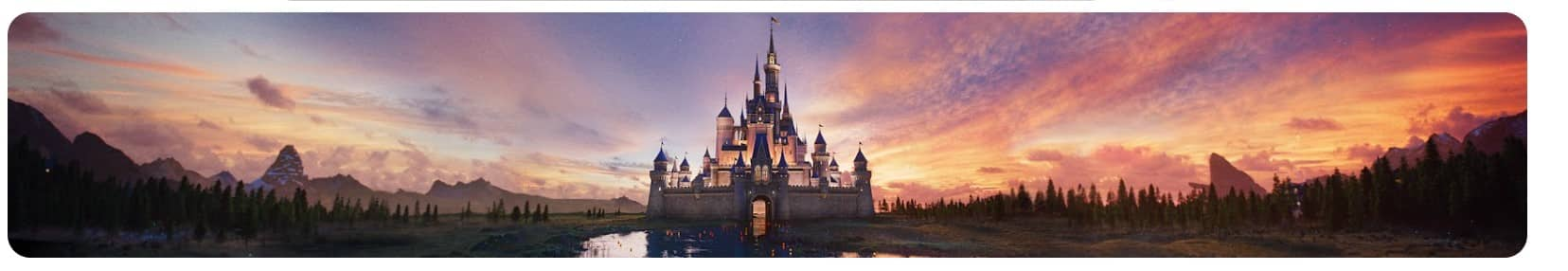
Disney could have used its banner to advertise its newest releases, but instead, it chose to keep them recognizable and simple.
And what a choice!
The familiar Disney castle is the brand's signature landmark, something most of us could probably recognize from a mile away, making for a perfect banner element.
10. Samsung
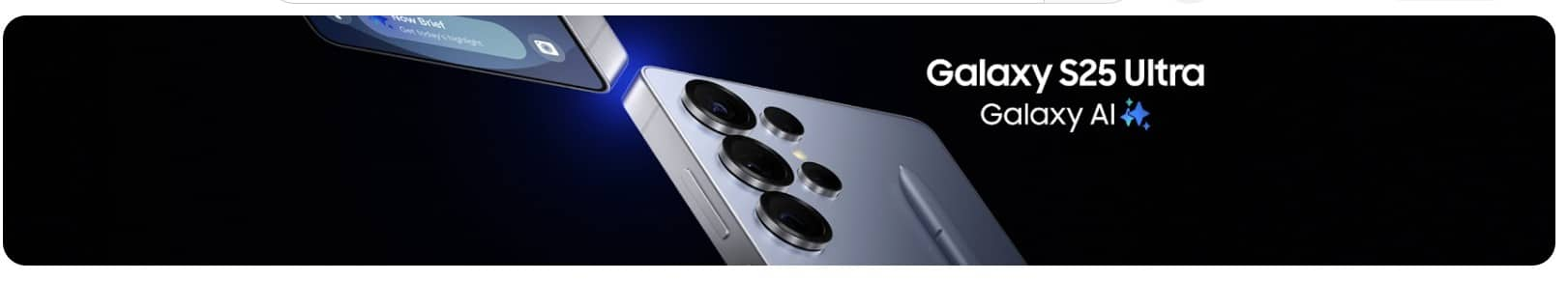
Samsung is choosing to keep it fresh and up-to-date by using its newest product release as a banner. It is not only a great way to showcase new products, but also to show viewers that you are active on your channel.
Make a YouTube banner that tells your story and makes viewers click play instantly
So, what’s it going to be?
A blank, forgettable banner that makes people scroll away faster than a bad Netflix trailer?
Or a bold, eye-catching, this-channel-is-worth-my-time kind of banner that stops them in their tracks?
You know the answer.
Your YouTube banner is the first scene of your story, the hook before someone decides to hit play.
Get it wrong, and they might never stick around long enough to see your best content. Get it right, and you set the stage for binge-worthy viewing.
Now, armed with the tips from this guide, you’ve got everything you need to make your channel look as excellent as its content is.
Need a little extra help? With CorelDRAW’s 15-day free trial, you can create professionally designed banner in minutes that isn’t just good, but impossible to ignore.
Meet the experts: Emilie Schäfferling

Emilie Schäfferling is a storyteller who blends data-driven insights with creative expression, turning complex ideas into clear, engaging narratives that make even advanced information accessible to a wide audience.
With a background in creative disciplines, Emilie has a unique skill set that helps her break down complicated concepts into meaningful, concise insights. Her storytelling approach serves a dual purpose: simplifying information while connecting with audiences on a personal level.