
Irfan Taufik
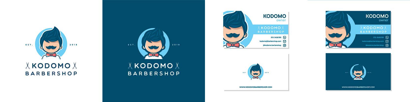
Business cards are not only one of the first impressions that potential customers have of you and your business, but they're also very much part of your brand imaging. Unlike brochures that are created for a specific event, business cards are designed to be handed out at any time and on any occasion. Because your business card should reflect your brand, consideration must be given not only to the color and design of the card but the font that you use as well.
As stated, your business card is part of your brand image. This means that every business has a slightly different version of the perfect font for a business card is. Beyond brand image, the second most important reason for selecting the correct font for your business card is for readability. Because the print on a business card is so small, many font options are not appropriate as they will not be easy to read in a point size between 8-16.
Designing business cards is one part creativity and one part strategy. You want your card to reflect your brand image, you want it to stand out in a stack of business cards, and you want it to be easy to read. Here are some considerations to make when deciding on the best font for your business card.
Start a Free 15-Day Trial Now!
Business cards provide several pieces of information in a small amount of space. Because of this, the font size you choose will need to be small enough so that all of your information can fit on the card without looking crowded, but still large enough that the information can be easily read. Here are some best practice tips on font size.
As with other parts of your business, your business card is an area where you can set yourself apart from your competition by the choices you make regarding colors, graphics, and font size. Designing the perfect card for your business requires consideration, not just about the information that you should include on the card, but how that information will be consumed and regarded. Will your potential customer squint as he or she tries to read the information in a tiny script or will he or she walk away feeling confident that you're just a phone call away? A lot of that depends on the font you choose.
Start a Free 15-Day Trial Now!