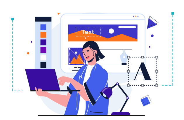
There's a moment every graphic designer knows too well.
It’s late at night, the world is quiet, and you’re deep in the zone—cycling through font options, second-guessing your color choices, or otherwise adjusting design elements hoping that it will all somehow just click.
Your design is evolving, and maybe it’s not perfect yet—but you’re right on the edge of a breakthrough.
The client asked for "bold but elegant," and somehow, you've ended up with something that feels more like “chaotic and unsure.”
We've all been there. And we've all made it out on the other side.
Because while creativity is essential, consistency and clarity come from something else—following tried and true graphic design tips and principles.
The essential building blocks that give your work its power.
Studies show users form their first impression of a design in just 50 milliseconds, and those snap judgments influence trust, clicks, and engagement.
Setting yourself apart from the competition is tough, but with the right toolbox it becomes easier.
This guide breaks down the key principles that top designers rely on every day—plus how to put them to work with tools like CorelDRAW Graphics Suite, a leading designer software solution.
If you're tired of designs that almost work and wondering how to get better at graphic design, start here.
And when you're ready to put theory into practice, try CorelDRAW free for 15 days. Let's sharpen your eye—and your results.
What does a graphic designer do?
Imagine being a translator but instead of switching between languages, you're converting ideas into visuals.
A graphic designer distills chaos into clarity.
They turn loose thoughts into logos.
They organize product info in a way that makes people actually want to read it.
They balance pixels like a tightrope walker, nudge design elements and tweak typography until it feels right, and solve visual problems most people don't even realize exist.
And they do it fast with deadlines breathing down their neck and coffee as their co-pilot.
7 rules of graphic design
Back to that midnight moment.
Your design's almost there, but something's off.
The layout is kind of awkward. Nothing stands out. Everything feels…tired.
This moment is when most new designers—especially those just diving into beginner graphic design—start moving things around randomly.
But experienced designers? They fall back on established principles.
These principles are the invisible architecture behind every successful design, and they apply whether you’re building brand assets or tackling passion projects at 2:00 am. And they’re rooted in the graphic design best practices that professionals swear by.
These principles improve your visual storytelling and sharpen your graphic design skills, no matter your level.
They guide the eye, organize chaos, and help you communicate clearly, even when you're five coffees deep and two pixels from burnout.
Let's break them down like the creative survival kit they are.
1. Contrast
If your design feels flat, dull, or forgettable, you're probably missing contrast.
Contrast is what makes a design eye-catching: light vs. dark, big vs. small, bold vs. subtle.
It's the reason you spot the call-to-action button in a sea of clean layouts.
When used intentionally, it creates focus. When ignored, everything blends into the same muddy tone.
If everything's bold, nothing is.
Use contrast through color (think contrasting colors like white text on black), size (massive headline, smaller subtext), or shape (a circle in a field of squares).
But don't go too wild. Contrast should bring clarity, not chaos.
A strong grasp of color theory can elevate this even further, helping you make confident, intentional choices.
2. Emphasis
Every element of a design tells a story, and every story needs a main character.
That's where emphasis comes in.
Let's say you're designing a concert poster. What should your audience notice first?
The band? The venue? The date?
You need to decide, or the design will decide for you. And not in a good way.
Use color shifts, typography, scale, or alignment breaks to lead the eye to the star of the show.
Emphasis helps your viewers know what matters most at first glance—before they click, scroll, or bounce.
Be mindful of your background image too. If it’s too busy, your focal point might disappear.
3. Balance

You wouldn't shove all your furniture into one corner of a room, right? The same goes for your design’s layout.
Balance isn't always about symmetry, but more so about stability.
It's what makes your composition feel grounded. You can use symmetrical layouts for a formal look or asymmetrical ones for energy and movement.
Either way, the goal is to make the viewer understand that the design has thought behind it.
4. Repetition
Repetition creates rhythm. It builds brand recognition and tells the viewer: "You're in the right place."
Using the same fonts, color palette, icon styles, or layout rules makes your design feel professional and cohesive.
The human brain loves patterns. In fact, it finds comfort in them.
So, repeat. Then repeat again.
5. White space

White space, also called negative space, is what isn't there—and that's exactly why it's powerful.
Don't crowd every inch with elements.
Space gives your content time to breathe, your eyes a place to rest, and your design a sense of sophistication.
Whether it's space between sections, around headlines, or just a little extra padding, white space does more by doing less.
6. Movement
Movement in graphic design doesn’t just mean animations or fancy transitions, but the invisible path your viewer’s eyes take across the page or screen.
As a designer, your job is to guide that journey with intention.
Every line, shape, and repeated element contributes to the rhythm of a piece.
Diagonal lines can add tension and energy. Repetition creates flow. Contrast and visual hierarchy tell the eye where to stop and where to go next.
These lines are your way of choreographing the viewer’s experience.
Want to test your design’s movement?
Show it to someone and ask, “where did your eyes go first? Then where?”
If their answer matches your intention, you’ve successfully used movement to tell a visual story.
7. Pattern
Patterns aren't just for wallpaper. In graphic design, they're foundational for branding, packaging, and digital design.
They show up everywhere: the aforementioned branding and packaging, on websites, banner ads, and social media templates.
Patterns reinforce ideas through repetition. They can suggest style (vintage, modern, playful), create texture, or highlight key areas.
Designers often use brand logos or visual motifs to build recognizable patterns across print and digital experiences.
Graphic designers can use patterns to:
- Reinforce branding
- Direct attention subtly
- Create emotion or familiarity
- Break monotony in minimalist designs
A brief history of graphic design
Back at your desk again.
The cursor blinks. You're still thinking about that layout, that typeface, that one visual that just won't land the way you want it to.
It's tempting to feel like you're inventing everything from scratch. But you're not.
You're building on a design legacy thousands of years in the making.
Graphic design didn't begin with branding decks or banner ads.
It began when people realized that pictures could accomplish what words couldn't. It grew through invention, cultural shifts, political upheaval, and artistic rebellion.
The way we design today is a remix of the past, refined by technology, shaped by style, and endlessly evolving.
Let's rewind and see how we got from charcoal on stone to the scroll-stopping designs we see on screens today.
Prehistoric to print
Long before anyone opened CorelDRAW or used words like "branding," humans were already designing with intent.
In 38,000 BCE, cave paintings acted as humanity's first visual language—depictions of animals, hunters, and rituals scratched into stone to share a message or mark a moment.
Fast forward to around 3000 BCE, the Sumerians introduced pictographs, the earliest written language, transforming visuals into information.
Then came Chinese woodblock printing and the first movable type press in 1040 CE. Each invention pulled visual storytelling forward.
But nothing shifted the landscape like the Gutenberg press in 1440.
Suddenly, text and images could be mass-produced, and graphic design had its first true medium—the printed page.
Heraldry, signs, and the rise of identity
As commerce evolved, so did the need for identity.
In 1100s Europe, heraldry emerged—ornate symbols that represented families, kings, and knights.
These were early logos meant to signal power, origin, and allegiance.
By 1389, English alehouses were required by law to hang signs to identify their businesses.
And just like that, storefront branding was born.
Advertising entered the scene in the 1620s with corantos, broadsheets that were precursors to today’s newspapers.
Lithography followed in 1796, giving us posters that screamed across city walls and flyers that introduced new products to the masses.
The industrial revolution and design as a profession
As printing and advertising exploded in the 1800s, the need for visual consistency became clear.
With this followed chromolithography, or vibrant, multi-colored print that turned everyday materials into canvases for messaging.
In 1903, Austria gave the world the Wiener Werkstätte—the first formal graphic design agency.
Design was no longer just a trade; it became a career.
Brands needed style. Businesses needed visuals. And suddenly, design had a seat at the table.
The Bauhaus and the birth of modernism
In 1919, the Bauhaus school opened in Germany and flipped design on its head.
It wasn't about decoration anymore. It was about function. Simplicity. Geometry.
Designers like Herbert Bayer taught that design should communicate clearly, using sans serif typefaces, grids, and minimal shapes.
This stripped-down approach challenged the ornamentation of the past and laid the foundation for everything from corporate branding to today's minimalist UI.
By 1922, William Addison Dwiggins gave this new discipline a name, "graphic design."
Art Deco and commercial style
The 1920s and '30s embraced elegance with Art Deco, a style defined by symmetry, sleek lines, and rich colors.
This was the era of ornate typefaces and gold-leaf posters, drawing influence from Egypt, jazz, and industrial progress.
Art Deco was modernism with glamor.
It wrapped messaging in luxury and precision, becoming the style of choice for everything from department store ads to film title cards.
Swiss Style and the International Typographic Revolution
By the 1950s, the design got clean. Radically clean.
Swiss style, also called the International Typographic Style, took Bauhaus’ ideas and pushed them further.
Think Helvetica, asymmetric layouts, and grid systems where every line was intentional.
The focus was clarity. Simplicity. Readability.
It's no coincidence that this era birthed the visual language of corporate logos, subway maps, and modern editorial layouts. It made design global.
Minimalism: The power of less
Minimalism emerged in the 1960s and '70s and was inspired by Japanese aesthetics, the De Stijl movement, and the architectural principles of Mies van der Rohe.
Minimalism preached the mantra that “less is more.”
Designers like Dieter Rams and Buckminster Fuller pioneered minimalism beyond the canvas, creating products and visual systems with stripped-back honesty.
Minimalist graphic design rejected the noise.
It favored white space, primary colors, and visual restraint. Nothing was decorative. Everything served a purpose.
It still influences today's most elegant designs, such as Apple hardware and packaging, or modern web interfaces.
Psychedelia, punk, and the loud '70s
While some designers were embracing clean lines, others embraced chaos.
The 1970s exploded with visual rebellion.
Psychedelic art brought a wild color scheme and swirling typefaces. Disco added sparkle, funk, and motion.
Meanwhile, punk delivered gritty black-and-white zines with hand-drawn fonts and zero polish—on purpose.
It was a decade of experimentation, born from music, activism, and DIY culture.
This was the visual language of rebellion, and it still echoes in design today.
The digital awakening of the 1980s
The '80s were bold and suddenly…digital.
Apple released the Macintosh. CorelDRAW was born.
Designers could manipulate images, create layouts, and experiment without physical materials. And they did—eagerly.
Neon colors. Geometric shapes. Techno-futurist themes. Design pulled from Art Deco infused with electricity.
The SuperPaint program and vector fonts changed what was possible and made it easier than ever to break the rules.
Brutalism in architecture, bare, raw, and functional, also influenced early web aesthetics.
Its digital cousin would return decades later with a vengeance.
The wild energy of the 1990s
Graffiti-inspired fonts, underground rave posters, messy layouts, and shock-value branding defined the '90s.
It was the birth of grunge design.
Color exploded again—fluorescents, gradients, weird patterns. The infamous font, Comic Sans, was born, and the distressed typeface were everywhere.
Abstract shapes and 3D renderings became mainstream.
This era was graphic design saying: We don't need your rules anymore.
Geometric style and the return to structure
As technology advanced, so did design software. And with it came a renewed love for structure.
Geometric design, rooted in ancient Greek pottery and revived through modernist movements like Cubism, began appearing across logos, posters, packaging, and web elements.
Triangles, circles, and cubes were not just shapes but statements. Geometric design combines mathematical precision with visual clarity.
Designers used it to bring order to chaos—and sometimes, to create new chaos with sharp, contrasting shapes and vibrant overlays.
Brutalism reborn online
In 2016, something strange happened: designers began rejecting beauty.
Brutalism came back—not in concrete, but in code.
Inspired by post-war architecture, Brutalist web design favored raw HTML, minimal styling, and uncomplicated navigation.
No animations. No smooth scroll. Just content, unadorned and unapologetic.
It is often aggressive, sometimes nostalgic, always fast, and hideous to some. It was designed as a protest against over-optimization and aesthetic sameness.
These sites didn't try to look good, but instead tried for honesty.
Brutalism isn't for everyone. But for brands seeking attention and authenticity, it hits hard.
Texture in design
Texture is the surface quality of a piece of design and its visual tone.
It can't be touched physically, but it can make something feel rough, soft, layered, or real.
Texture gives flat images depth. It adds character. It invites the viewer to feel something without touching anything.
There are two main types of texture.
Actual texture refers to real-world surfaces, like the thickness of paper on a business card or embossed lettering on a wedding invitation.
Implied texture, on the other hand, is visual. It's built through shapes, layers, lines, and color—using tools like CorelDRAW Graphics Suite to mimic fur, stone, fabric, or sand.
Whether it's environmental (like leaves or rocks), human-made (like textiles or paint), or biological (like feathers or skin), texture gives your design a sensory edge.
So, if your layout feels flat or lifeless, think about what it feels like. Then, add texture—not to decorate, but to communicate.
How do I teach myself graphic design?
Maybe it started with a font you couldn't stop staring at. Or a poster that stuck with you long after you left the café.
Somewhere along the line, you stopped just noticing the design and started wanting to make it yourself.
Then the question is “Where do you begin?”
The great thing about graphic design is that there's no single way in.
Some people go the traditional route. Others build their skills through one tutorial, one side project, or one wild idea at a time.
What matters most isn't where you start—it's that you do.
Start by observing everything. Look at ads, menus, apps, packaging, or really anything with a layout. Ask yourself, “why does this work?”
Then, try recreating it. Not to copy, but to understand. The more you break things down, the more second nature they become.
Then comes the practice. Design a fake brand. Make an event poster for something that doesn't exist. Create album art for a playlist you love.
These small, self-initiated projects will teach you more than any lecture ever could.
And when you're ready to level up, resources users-love-simple-and-familiar-designs-why-websites-need-to-make-a-great-first-impression CorelDRAW Academy are there to help.
It's real training from real creatives, designed to take you from experimenting to executing with confidence.
Graphic design isn't about waiting for someone to tell you you're ready, but about learning by doing and discovering your own visual voice along the way.
Tips for graphic design that turn chaos into clarity
Graphic design is equal parts creativity, skill, and knowledge.
Whether you're reworking a logo at midnight or hunting for the perfect font, the foundation never changes. The principles guide the process.
From mastering contrast to understanding movement, the best designs aren't just beautiful—they're intentional.
Every color, shape, and space work together to deliver a message that connects.
So, if your brain's out of pixels and your layout still doesn't feel quite right, come back to the basics. They won't let you down.
Want to sharpen your skills and actually put all of this into practice?
If you're serious about how to get better at graphic design, start with the right tools.
Try CorelDRAW free for 15 days and create your own designs that stand out for all the right reasons. It's where the learning curve flattens, and your results start to take shape.
Start designing with clarity using CorelDRAW Graphics Suite
Build visuals that feel as sharp as your ideas. Every tool, every shortcut, every pixel—working with you, not against you.
Try free Learn more
Meet the experts: Emilie Schäfferling

Emilie Schäfferling is a storyteller who blends data-driven insights with creative expression, turning complex ideas into clear, engaging narratives that make even advanced information accessible to a wide audience.
With a background in creative disciplines, Emilie has a unique skill set that helps her break down complicated concepts into meaningful, concise insights. Her storytelling approach serves a dual purpose: simplifying information while connecting with audiences on a personal level.