As a designer, no one knows what you do quite like you—and your peers.
That’s why the team here at Corel is joining forces with creators around the world—to bring you fresh perspectives on design techniques, workflows, and tips and tricks for your work from the folks who do it every single day.
In this article, you’ll hear from graphic designer Angelo Borges on the art of iterating when developing brand identities—why, how, and how to get it just right.
Let’s get started.
Want to learn more about the creator? Read our Q&A with Angelo Borges, too!
In this post, I would like to discuss the incredible possibilities of creating a visual system with variations on visual brand identities using CorelDRAW Graphics Suite.
As an example, I’ll explore a project that never had the chance to get off the ground, so I would like to take this opportunity to give it the chance it deserves to shine.
Brandemy was conceived as a hub for teaching and providing tools for branding at all levels. Although branding doesn't belong to design (or any other discipline, as branding is a discipline in itself), design influences brand—and we aim to have a proprietary, inspiring, and creative character.
I have been a CorelDRAW user since 2003, even before I imagined that more than two decades later it would still be the main creative tool in my career as a designer and branding consultant.
I have a great affinity and skill with vectors, which has helped me strongly develop my style as a graphic designer and in more complex strategic branding projects. These projects often include, at a minimum, a redesign of visual identity using various vector resources.
And this is where what I consider one of CorelDRAW's greatest qualities comes in: Its simplicity and wide range of tools to support and explore my creativity.
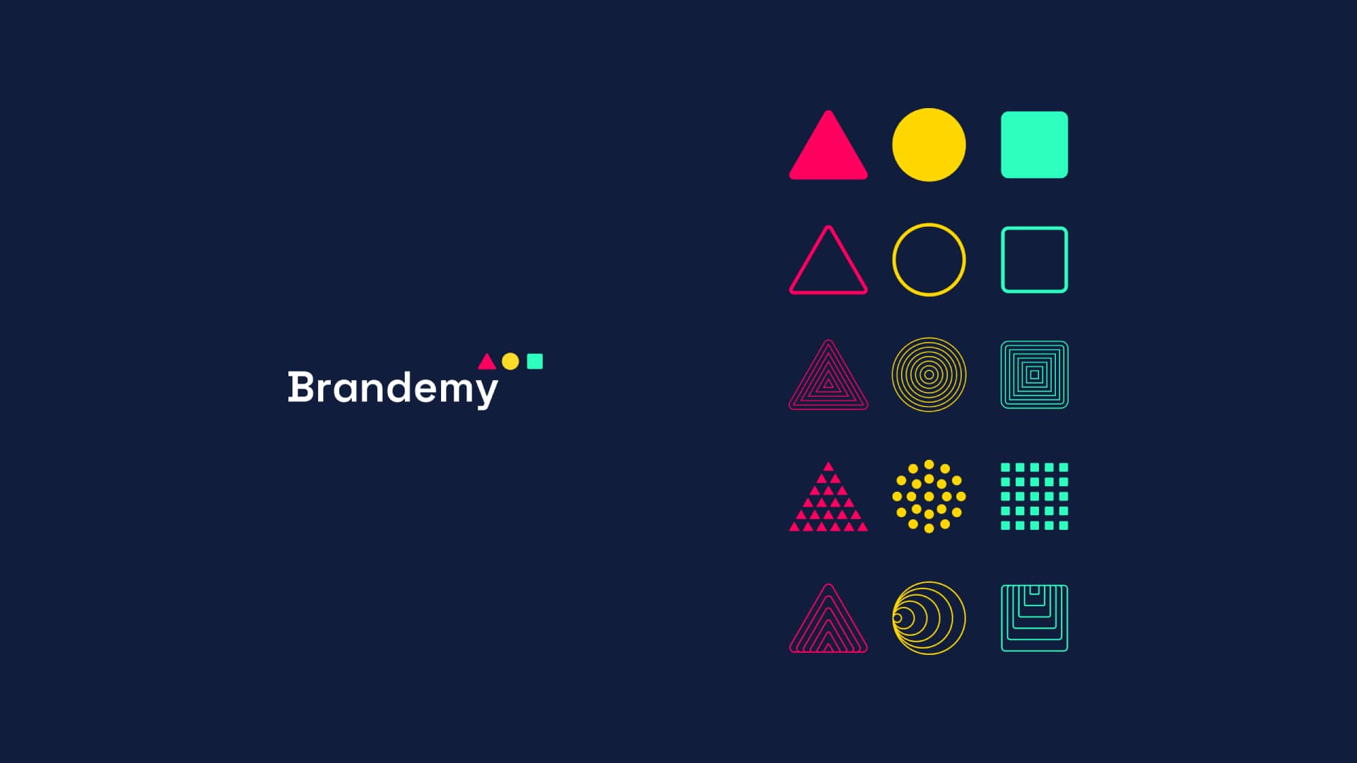
Let’s take a closer look at the Brandemy example.
After developing a visual identity with obvious shapes that evoke consistency and technical creativity, the triangle, circle, and square, I quickly understood that this visual system needed more movement and energy.
So I started developing supporting elements inspired by the three basic elements of the visual identity to establish differentiation and personality for the project.
Imagining variations, inspired by shapes within the shapes, these vibrant elements soon transformed into supporting graphics and backgrounds to give the brand's visual identity a universe to call its own.
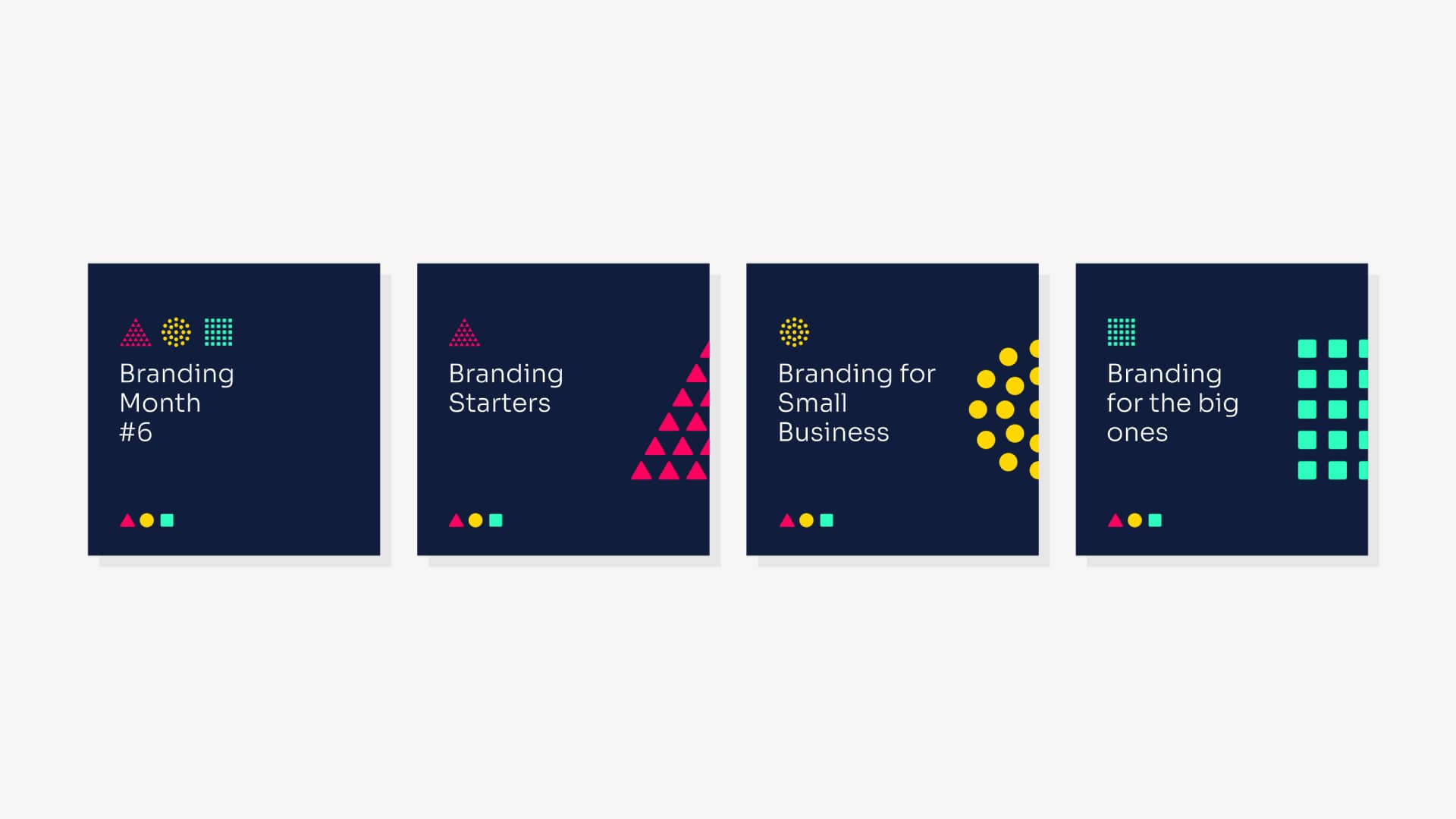
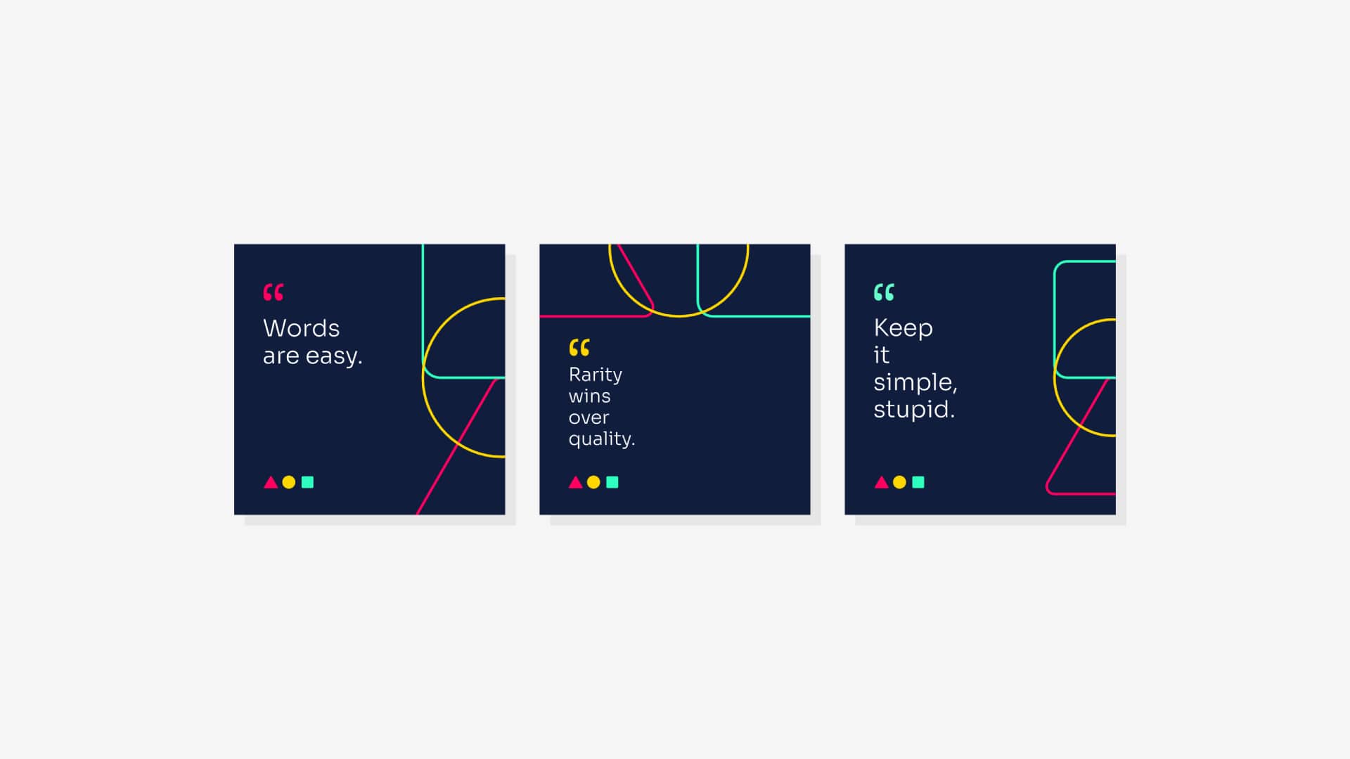
We can see the impact that even a simple and seemingly trivial idea can have on a project if we apply our creativity using a powerful and user-friendly vector tool.
By combining technical knowledge, curiosity, practice, and attention to detail, added to the potential of CorelDRAW, we can experiment with shape placement and form, thereby creating projects that are born and sustain themselves.
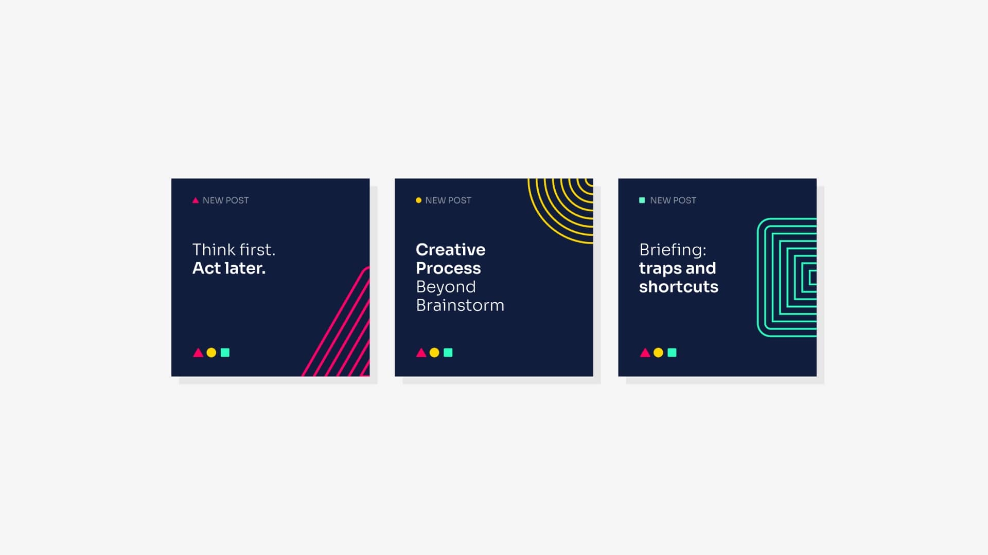
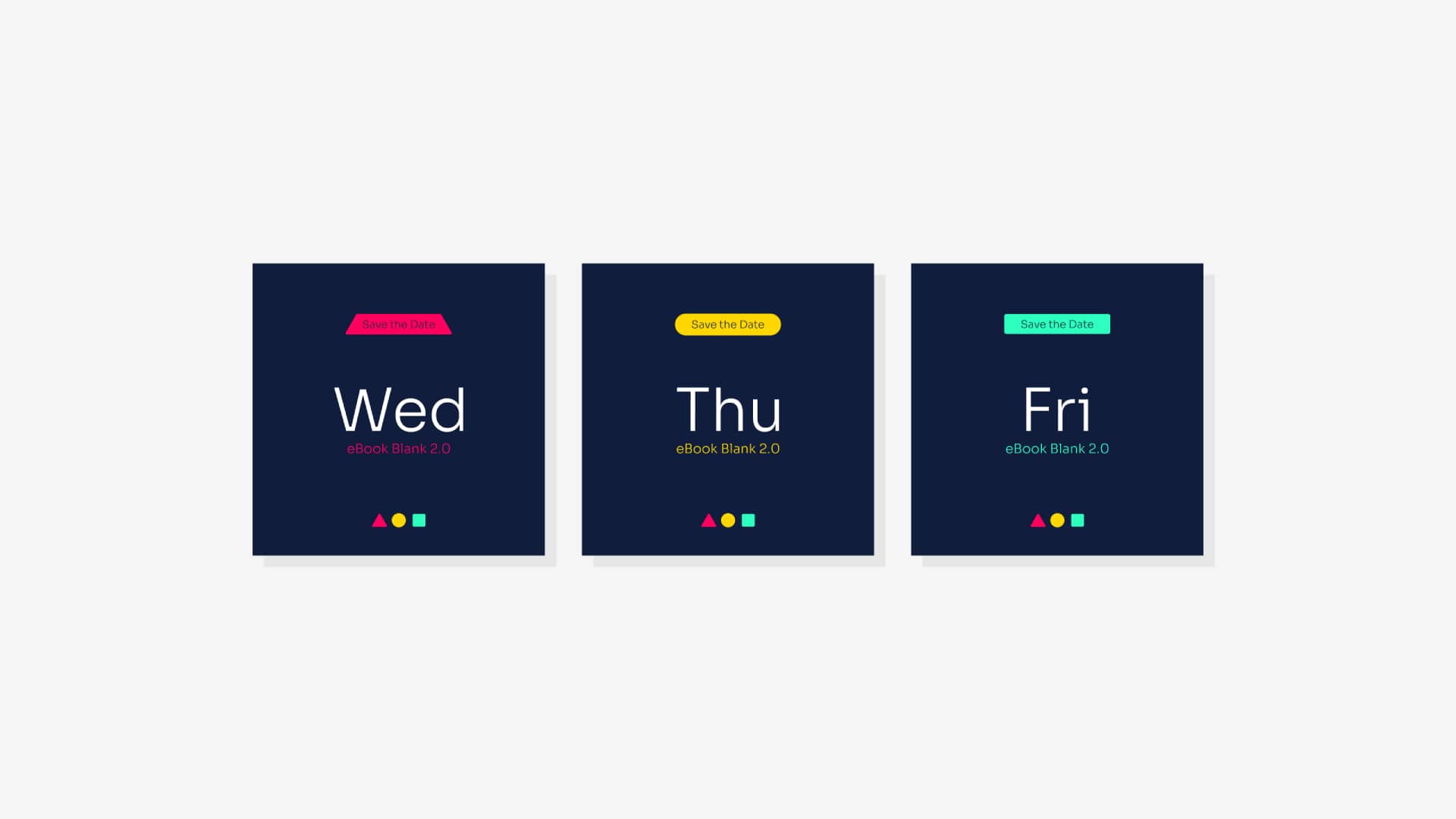
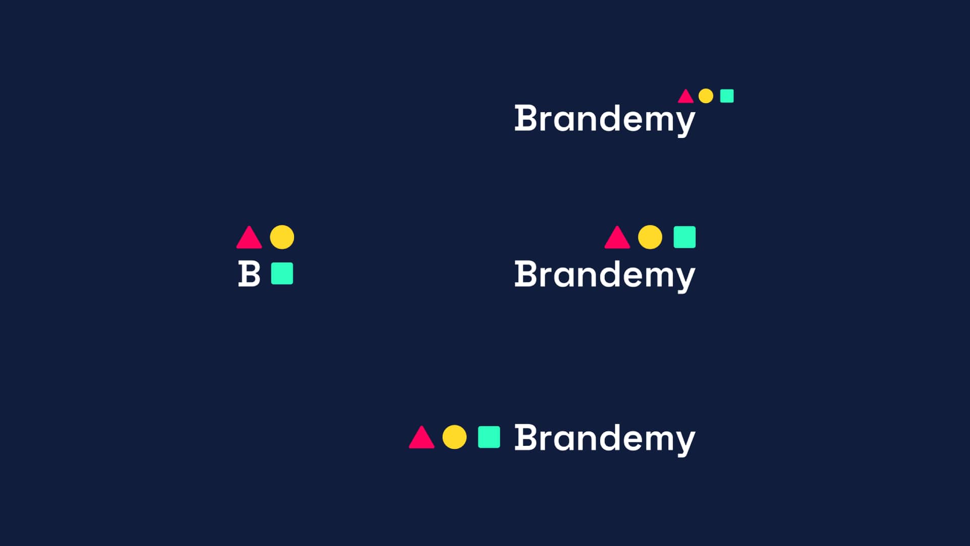
A constantly evolving visual system shouldn't have a fixed visual identity. I worked to create versions that match diverse scenarios and adapt to layout needs.
In this example, you can see how I’ve used the variations to cover a range from a maximum reduction to be used as a profile picture, to an extremely horizontal and almost provocative one.
Although it never had the chance to come to fruition, this is a project I'm very proud of, as it's full of life, possibilities, variations, and created entirely using only CorelDRAW to give shape to my vision and creativity.
Angelo Borges is a branding and visual identity designer with over 23 years of experience across countries and industries.
How to work with grids to develop visual elements.
Learn moreHow Lukman Febrianto puts AI tools to work in CorelDRAW Graphics Suite 2026.
Learn more