The team here at Corel is collaborating with designers and artists around the world to bring you the latest and greatest in design—because if anyone understands your work, it's your fellow designers and artists.
In this post, you'll take a closer look at how you can work with typefaces and customization features to design unique logos for clients—all through the expertise of graphic designer, Angelo Borges.
Want to learn more about the designer? Check out our full Q&A with Angelo Borges.
Typography has always fascinated me because it exists at the intersection of science, art, and intuition.
Well-constructed fonts don't strictly adhere to geometry or alignments: They are based on optical perceptions of curves, heights, widths, strokes, ascenders and descenders, ligatures, and much more, which makes typographic customization a challenge in every visual identity project.
In this post I will explore some logo customizations I have created for clients, exploring the technical and creative possibilities.
In this age of hyper-connectivity, we receive information from every corner of the planet. It's no different with brands. I believe it's important in a visual identity project to have the greatest possible degree of differentiation (provided, of course, that it's guided by the client's needs).
Logo customization is a method of distinguishing a brand either subtly or significantly, since we are creating something unique and not just using a ready-made font.
Even some oddities in a familiar font can be useful for quickly reminding the public to recognize a visual identity.
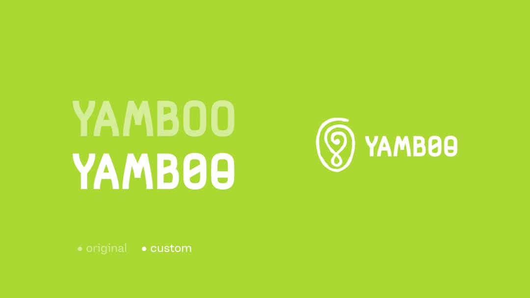
Let's start with customizing specific characters. The idea here is to create personality for visual identities that aren't accompanied by a symbol. In these cases, I consider a more pronounced customization fundamental, especially in fonts without distinctive characteristics.
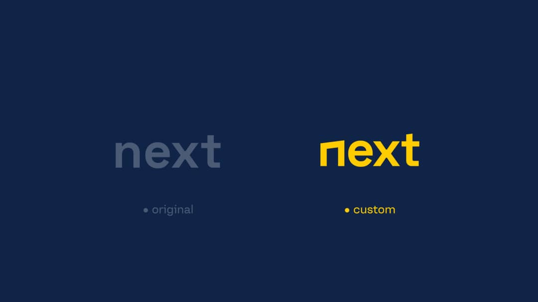
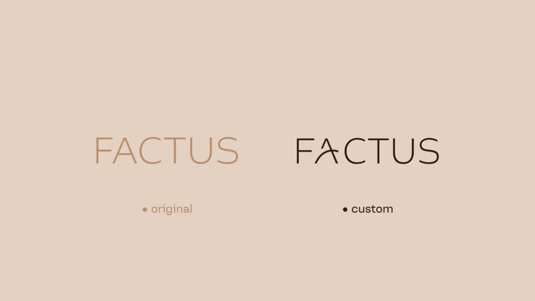
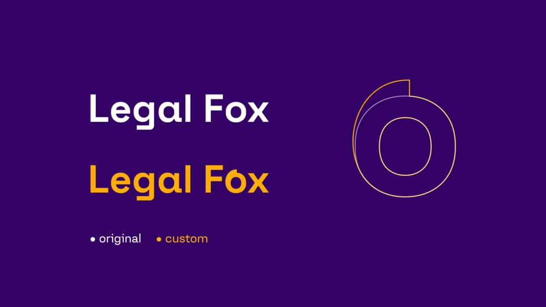
We can see that adjustments made in just one character are enough to create the distinction that turns a font into a brand identity.
It's important to say that in these cases, these changes seem simple, but in reality, they require a lot of effort to refine to the point of being pleasing to the eye. It's not uncommon to revisit the typographic refinement after some time to reassess it with a rested mind and eyes.
Adding more characters works well and brings personality, with the look and feel that a brand identity should have. But of course, a designer should always either maintain an aesthetic standard or break it completely!
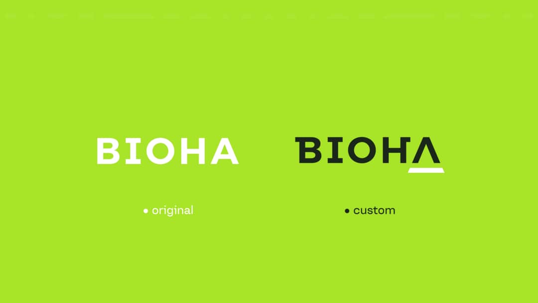
To judge whether shapes are consistent, you can turn the logo or individual characters upside down, enlarge them, reduce them, place them on different colors, and use different contrasts.
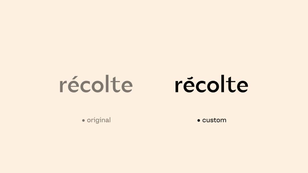
When we have fonts with more personality, we can make simpler customizations, but still enough to differentiate the brand from others, or simply to be different.
Tip: It's not a rule, but I have found that the possibility of creating a unique logo is greater when you work with professional fonts from more exclusive type foundries, as is the case above with the Seiva font by Fabio Haag Type.
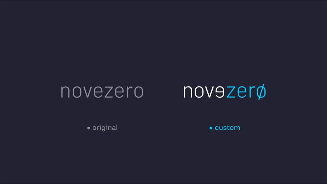
Another interesting method for customizing fonts is character inversion.
In this case, "novezero" in Portuguese means "ninezero," and by inverting the first "e," we create differentiation and also play with the letter becoming the number "9." There is also an adjustment on the last "o," making it represent the number "zero."
Simple, impactful, and effective.
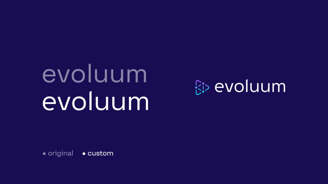
Mixed visual identities naturally have greater distinction because they are accompanied by a symbol. But even in these cases, a minimal change makes a difference, ensuring that the brand doesn't use a font that is exactly the same as one available for free download or purchase online.
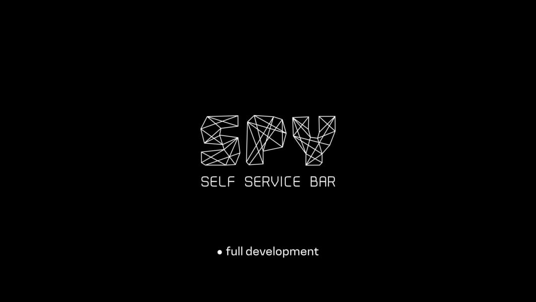
In one last example, we have the complete development of a logo. The challenge is enormous, the tests are practically endless, and the decision on the final result usually comes from exhaustion (in a good way) from so many versions and variations.
Before we finish, it's important to emphasize that commercial fonts have licenses and are protected by copyright. If the project doesn't have the financial resources to purchase a paid font, opt for those that are part of CorelDRAW or look for options on free font websites.
One absolute truth about logo fonts, regardless of the degree of customization: It takes a lot of effort, study, and a certain creative boldness to achieve your goals when it comes to logo customization.
CorelDRAW has excellent tools for you to explore your creativity: Outlines, rounded corners, welding, and much more. You should try, practice, and learn. The process is fascinating and the results are incredible!
Angelo Borges is a branding and visual identity designer with over 23 years of experience across countries and industries.
How to use vectors to bring brand identity variations to life.
Learn moreHow to work with grids to develop visual elements.
Learn moreHow Lukman Febrianto puts AI tools to work in CorelDRAW Graphics Suite 2026.
Learn more