CorelDRAW

Before getting into Pantone® Colors, let's discuss a few terms to understand better what we are talking about.
| Color Model | A color model is a way to define colors within the color space or color gamut. A color model is identified by a series of numbers, usually in three or four values that form each color, for example, an RGB color would be represented as R:0, G:160, B:196, whereas the similar color in the CMYK color model would be C:82, M:19, Y:15, K:0. |
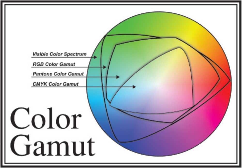
| Color Space | Simply put, a color space (also called color gamut) is the range of colors one device (eye, printer, camera) can detect. If we map these colors within the color space, you assign an area or boundaries to the color model. Any color outside these boundaries is considered out of the color gamut. |
There are a few color models to choose from when creating print graphics.
Some color models are based on the optical components of the colors, and others are based on how people "feel" colors are related to each other.
RGB, CMYK, and Pantone are some of the more common color models.
Looking at the color space of each more common model, I can see that the RGB color model is the largest, followed by Pantone and, finally, the CMYK color model.
Looking for a design tool with Pantone color options for your next print project? Download a free trial of CorelDRAW to gain access to over 25 Pantone Color Palettes
Pantone or Pantone Matching System (PMS) is a standardized color system that is used worldwide.
The colors are created with custom inks and are typically used when it is not possible to create a specific color using CMYK inks or when color consistency is required.
If a CMYK blue is printed at a shop in the United States, Canada and England, the colors will probably appear different when compared with each other.
If a Pantone blue (2728 C, for example) was printed in the same 3 shops, they would all look identical when compared.
Spot colors can also be used to indicate a specific area of a design that requires a treatment or effect that needs to be applied to the print job, such as applying a gloss lacquer to an object or using a specialty ink to achieve a certain effect, like indicating an emboss on a job.
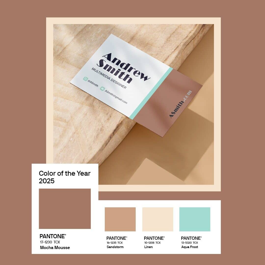
CorelDRAW® Graphics Suite has over 25 Pantone Color Palettes included within the application, including Pantone’s Color of the Year for 2025, Mocha Mousse. Our Pantone Color Palettes ensures you have a wide variety of spot palettes available for your design needs.
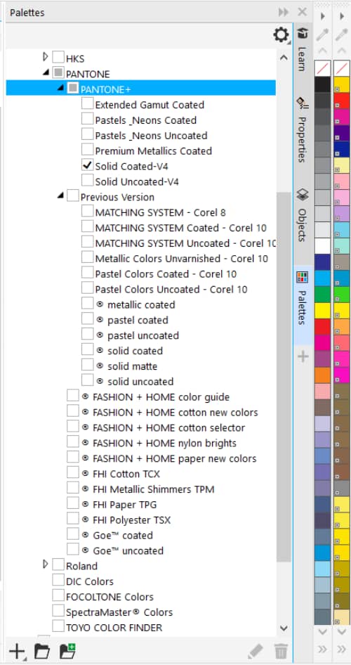
They cover everything from standard coated and uncoated to neons, metallics, pastels, fashion, and the GoeTM for coated and uncoated stock.
It is simply a matter of selecting the desired palette from the Palettes docker.
Interested in learning more about using Pantone Colors palettes for print? Check out these examples of Pantone Color Palettes ideal for print and packaging.
When deciding which color model to use, remember the definitions.
An RGB palette has the largest gamut and is typically seen on computer screens or monitors.
Another area where RGB is used is in the creation of artwork for sublimation, laser engraving, or digital printing, to name a few.
CMYK is used during a 4-color printing processing and Pantone Colors are used where very specific colors are required or special treatments are needed during the printing process.
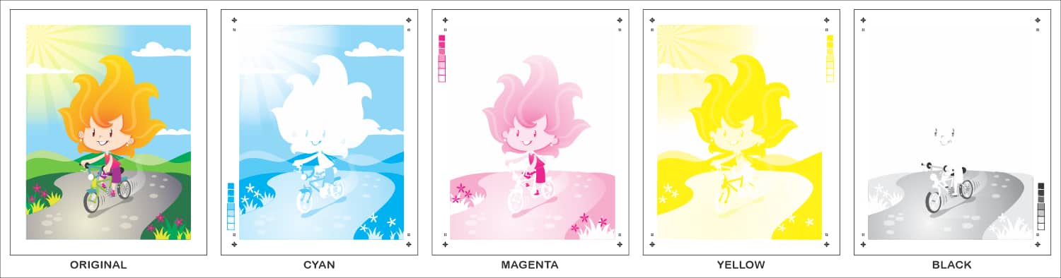
The CMY model is a subtractive model that is composed of cyan, magenta, and yellow. When all three primary colors are laid down on paper, they block white light from bouncing off the medium.
As all the colors have been suppressed, the eye sees black (the absence of any color).
In practice, however, CMY usually cannot be used alone.
Because of imperfections in the inks and other limitations, true black cannot be created by mixing inks.
To get a more pure black and grays, printers accomplish this by adding black ink, indicated as K.
Thus, the practical application of the CMY color model when printing is accomplished by using the four-color CMYK process.
CMYK is used for product packaging, print collateral, and magazine publications. When a design is sent to print, separations are created for each of the colors.
They are then printed on a press to achieve the final output.
The RGB model is an additive model. It is composed of red, green, and blue primary colors.
The gamut for the RGB model is rather large compared to CMYK, so it is a preferable color model to use when creating images for the web or that will be output to a digital device such as monitors, televisions, and digital printing.
The RGB color model has a larger color gamut and is primarily used for design work that is destined for a screen or monitor.
It is also used in photography whereas the Pantone Color System is used in printing, specifically for precise colors for screen printing.
Is Pantone or CMYK better for printing?
Well, that depends.
If the job calls for screen printing, only Pantone Colors can be used.
When creating screens for screen printing, spot colors are used so that there is one screen for each color.
If the printing is a four-color job destined for a printing press, then CMYK should be used.
That being said, it may be necessary to use both Pantone Colors and CMYK colors on the same job for color consistency or where special printing techniques are employed.
Watch as award-winning artist and designer, Mo Jogie, walks you through how to ensure your Pantone Colors are accurate for print with the latest Pantone Colors available within CorelDRAW in this webinar .
As a designer, it may be necessary from time to time to convert a design from CMYK to Pantone.
This is especially important if the design is a logo that needs to be screen printed onto a garment or possibly be vinyl cut to apply onto a window or for a sign.
Most applications that support both CMYK and Pantone Colors will allow this to be accomplished.
In some applications, it may be necessary to purchase a license to use the Pantone Colors.
In an application such as CorelDRAW that includes full rights to use the Pantone Color Palettes that it ships with, the steps are fairly straight forward in matching CMYK colors to Spot colors.
Following the above steps throughout the design will allow you to quickly prepare the design for accurate spot color printing.
With CorelDRAW Graphics Suite, you can be confident your colors are spot-on with integrated access to Pantone Color Libraries at no additional cost.
On the contrary, Adobe customers must purchase a Pantone Connect subscription on top of their Adobe Creative Cloud subscription to access the Pantone Matching System for color specification.
CorelDRAW, with the color management engine, will ensure that you get the proper colors as it was designed.
Whether it is a web design using RGB, a spot design for screen printing or a complex four-color design using CMYK inks and spot colors.
Ensure consistent color accuracy for any output with all the latest colors from Pantone.
Looking for a design tool with Pantone Color options for your next print project? Download a free trial of CorelDRAW to gain access to over 25 Pantone Color Palettes.