CorelDRAW
Develop your edge as an artist and designer with CorelDRAW’s Guide to Vector Design. Learn the basics of vector graphics and design, and feel empowered to tackle any challenge that comes your way.

We’ve covered vector graphics in detail in our previous posts, including how objects are created and why designers prefer the vector graphic format. But using vector graphics to make calculated points, lines, and shapes would be nothing without the final element that brings these designs to life: the application of color.
Understanding color basics is the key that will unlock doors for a skilled graphic designer. By harnessing the power of color theory, your vector art will be elevated to the next level. When you become proficient in defining and selecting the right colors from your digital image software, you will have honed a skill that produces vibrant rewards.
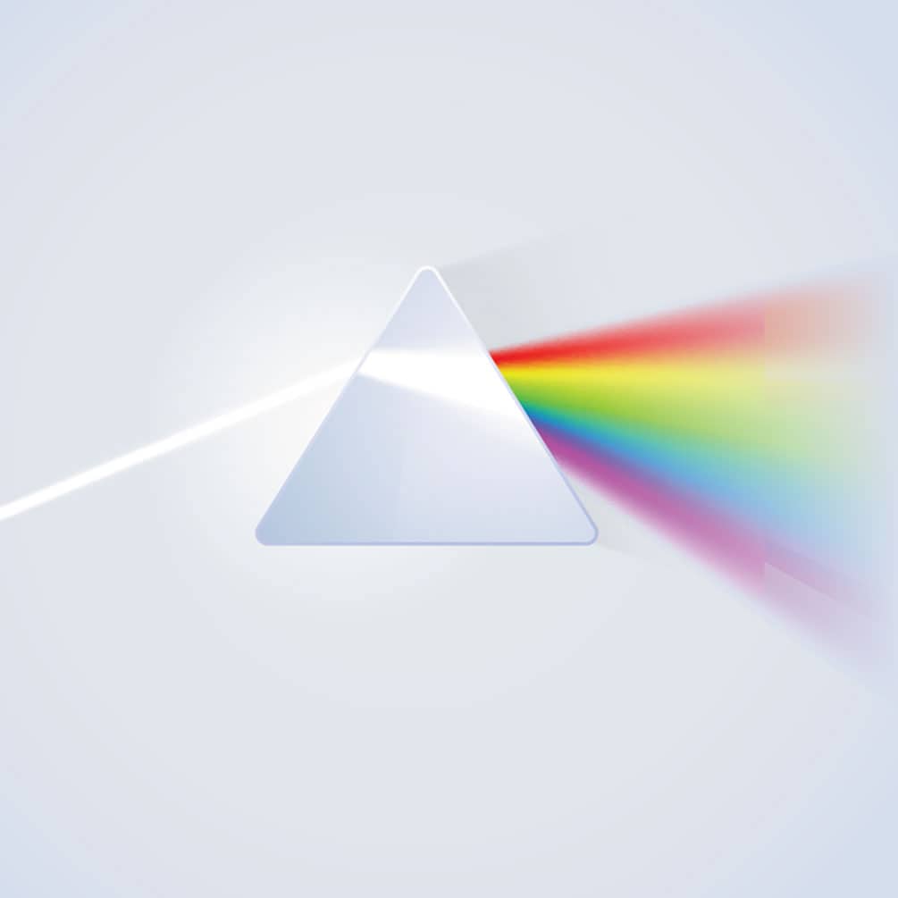
You may think you’re a natural when selecting the right colors for your designs. But did you know there is a vast difference between a human and a computer monitor when it comes to the interpretation of color? Humans interpret color through a complex biological process where the eyes and brain work together to convert reflected light wavelengths into recognizable colors.
How we see colors hasn’t changed since the beginning of time, while computer monitor technology has evolved over many years to what it is today. At their core, monitors follow a much simpler process to interpret color. Modern computer displays use a three-color palette, combining red, green, and blue light to formulate a specific color in an individual pixel, and these LED pixels work together to showcase an image.
Virtual colors are created in a manner very similar to an artist mixing different paints to produce the perfect color palette. Computers combine RGB light in the correct proportions to create colors defined by digital color codes. Displaying accurate colors in your digital designs involves understanding the basics of computerized color.
Four formats, or color models, are most often used to describe specific colors in digital palettes. They include:
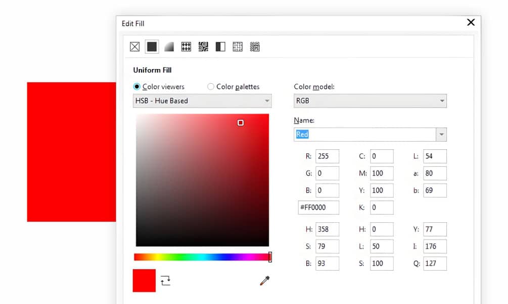
The simplest color format is RGB, an additive color model, which means the color is adjusted based on prescribed amounts of simpler colors. As the name suggests, RGB uses red, green, and blue light to create nearly 17 million unique colors simply by adjusting the pixel saturation, making it very practical for on-screen applications. Pixels are adjusted in each colored diode from zero to 255, with zero being off and 255 being fully illuminated. Here are a few examples to show how RGB color works:
The decimal naming system for RGB is a bit cumbersome. So, if you attempt to re-create exact color schemes, hex color codes provide a simplified solution. Hexadecimal values, known as a hex triplet, are calculated from each color combination in the format #RRGGBB. So, the hex color code format looks like this:
Often, graphic design software and other HTML applications read RGB colors in hex format. Calculators are available online for RGB-to-hex conversions. The eyedropper is another helpful tool for identifying hex codes.
CMYK is ideal for your printed designs. This model relies on masking full-spectrum white light to create mixed-ink colors. In other words, printed ink reduces the amount of light reflected on white paper, which is why CMYK is considered a subtractive color model. The base colors are the same as what you would find in a modern printer: cyan, magenta, yellow, and key (black), and colors are identified based on the percentage of each ink mixed, from 0-100%.
Finally, Pantone Color Systems provide a more real-life approach to color matching. Specifically, the Pantone Matching System (PMS) provides a universal language for a set of 9,758 unique, proprietary colors for designers and brands to use in print, packaging, digital, and screen printing designs. PMS colors are essential to brand identity and consistency. You can quickly identify a color in this system by its name, beginning PMS, followed by a series of numbers and a notation of whether it is printed on coated (C) or uncoated (U) paper.
Using colors previously selected by brands in your graphic designs is one thing the knowledge above will help you achieve easily. But what if you, as the designer, are tasked with selecting colors from scratch? That’s where a basic understanding of color theory comes into play.
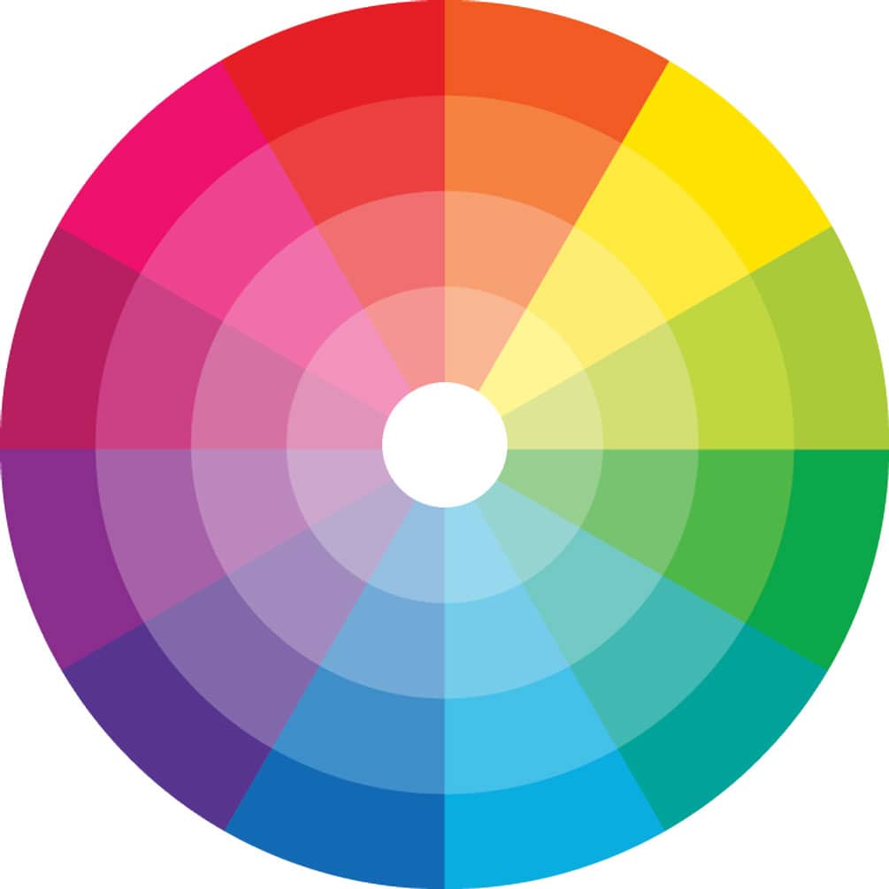
Color theory is based on the notion that color can have a profound psychological impact on people. It's a set of rules and practices for how to communicate an idea through color in visual media. Colors are grouped into three categories defining their relationship to one another:
A color wheel shows the relationship between different colors and can help a designer achieve contrast or a complementary color scheme. Designers often use tools, including color wheels like the one pictured above, to create harmony or evoke specific emotions with a given color palette.
The psychology of color has been studied in depth, showing that specific colors can affect moods. Yellow, for example, can signify caution or happiness. It’s not a coincidence that you’ll find many road signs warning of dangers created in yellow. Similarly, blue can evoke a sense of calm or a rise in energy. Branding kits for a day spa often include hues of blue and tertiary color schemes based on blues like lavender to evoke a sense of calm. Learn more about color basics in our Introduction to Color Theory tutorial.
Color is an essential component of any design project. Understanding how colors are created and defined is fundamental for the foundation of your color basics knowledge. As an aspiring graphic artist, you will use color throughout your career to make your designs look good and bring meaning, nurture familiarity, and elicit specific emotions.
When designing with vector graphics software, applying color is just scratching the surface of the design capabilities at your disposal. In the next article, we look at shape fills - which can be applied to vector elements to deliver incredible effects.
Vector Shapes
Using Shape Fill
Try CorelDRAW today for free, and take advantage of powerful tools for vector illustration, page layout, and more. Start creating today!
Try free Learn more